Business
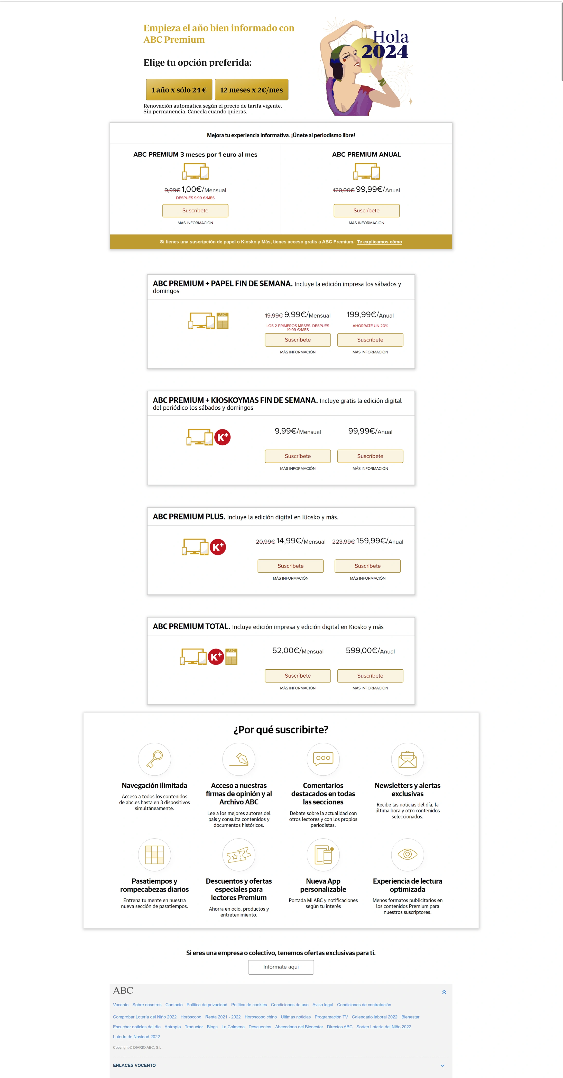
Subscription growth stagnated despite strong traffic. Mobile conversion was critically low. Launching a new offer required weeks of dev coordination.
13 brands. No shared architecture. Every change required coordinating teams nobody had authority over.
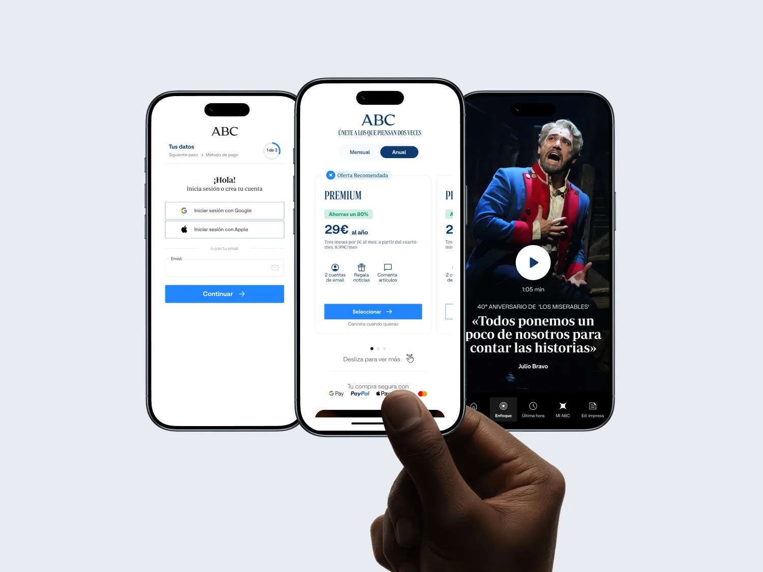
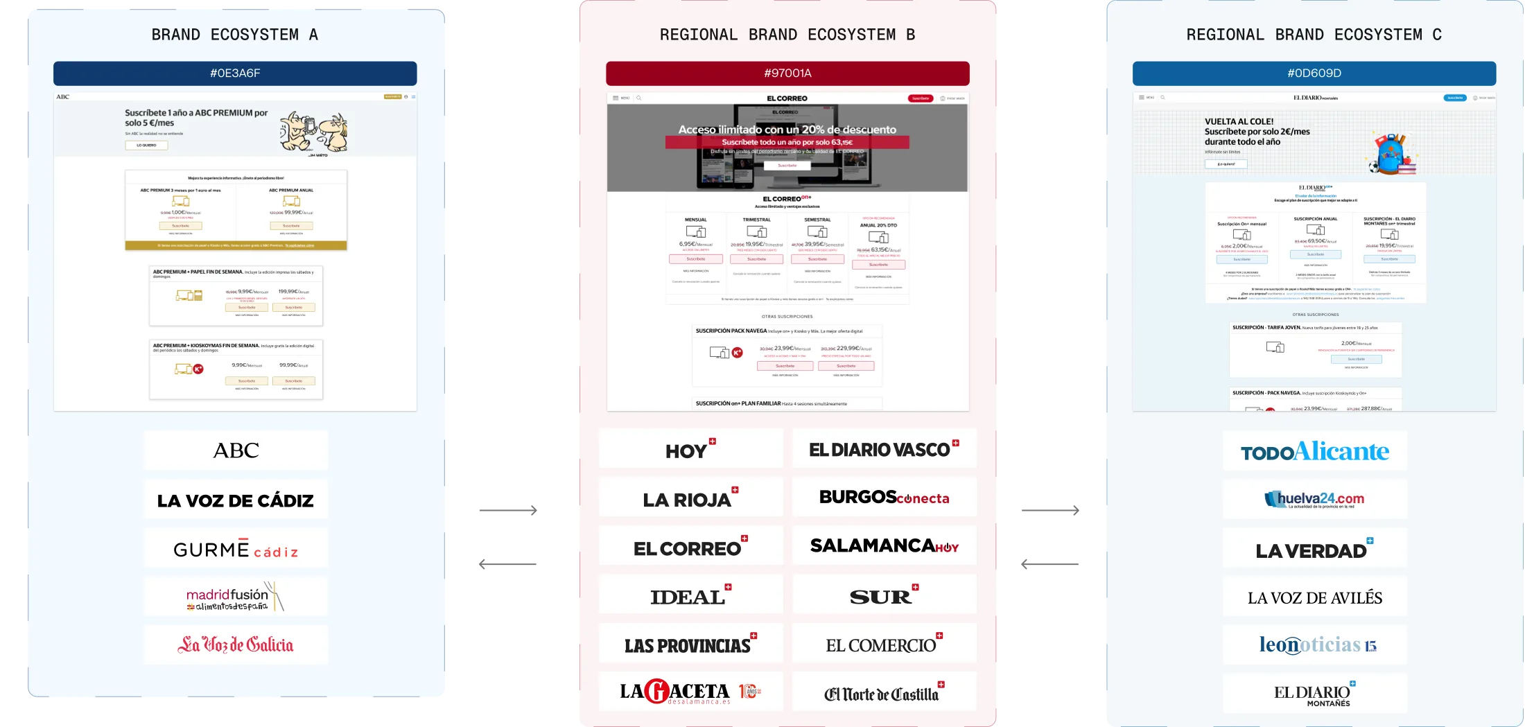
Vocento operates 13 news brands across three editorial groups. Each brand had built its own subscription experience by adapting components from other brands in the same group — then adapting those adaptations. The result was fragmented code, inconsistent UX patterns, and conversion funnels that nobody fully understood or could safely modify. Every change required coordinating multiple development teams. Every experiment risked breaking adjacent brands. The subscription model was generating revenue despite itself — not because of any coherent system.
“Every team knew the funnel was broken. Nobody had the authority — or the architecture — to fix it without risking what was already working.”
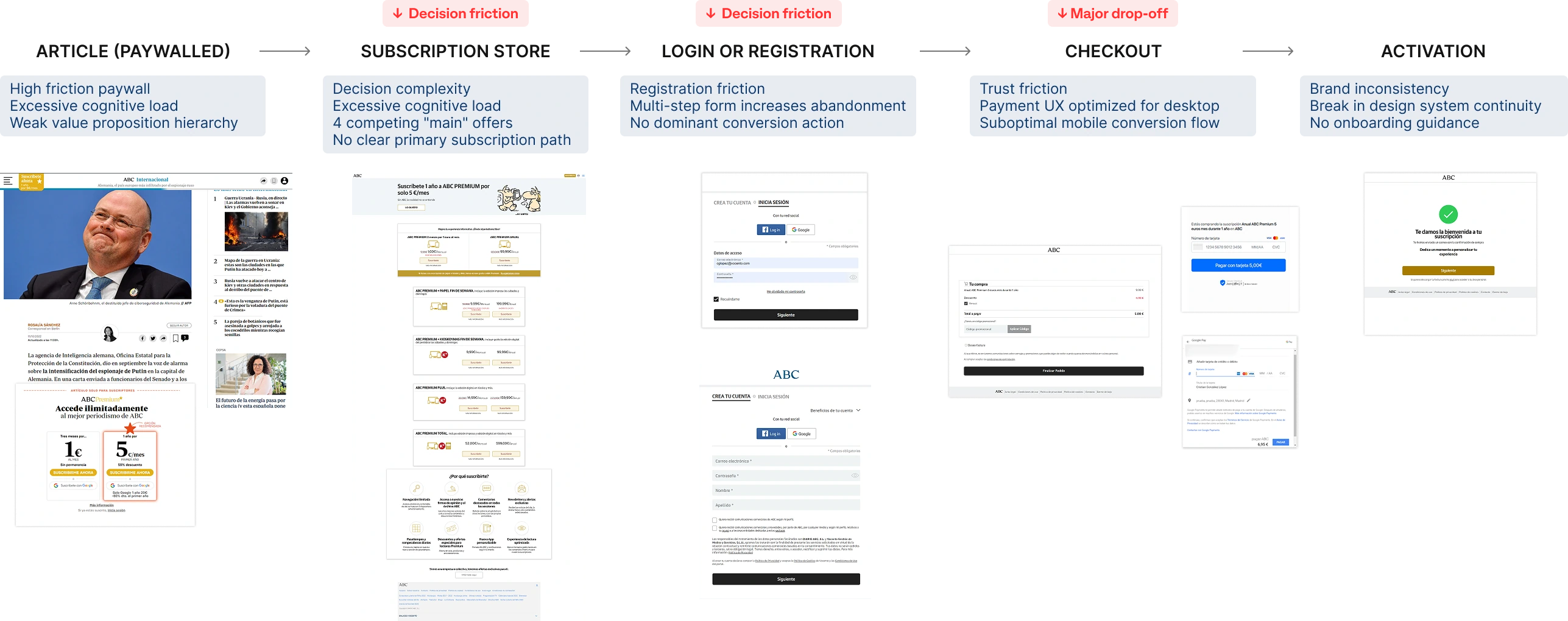
Before redesigning anything, we instrumented the funnel: continuous A/B experimentation across brands. Three forces were quietly breaking it.
Subscription growth stagnated despite strong traffic. Mobile conversion was critically low. Launching a new offer required weeks of dev coordination.
Decision paralysis from poorly structured plans. Long, confusing login, registration and checkout. Value framed as a transaction, not a premium experience.
No shared conversion framework. Components reused informally without contracts. No two brands measured the same thing.
Three friction points accounted for nearly all the drop-off — the same pattern across all 13 brands: the paywall (too many options), registration (too many fields) and checkout (too many steps).
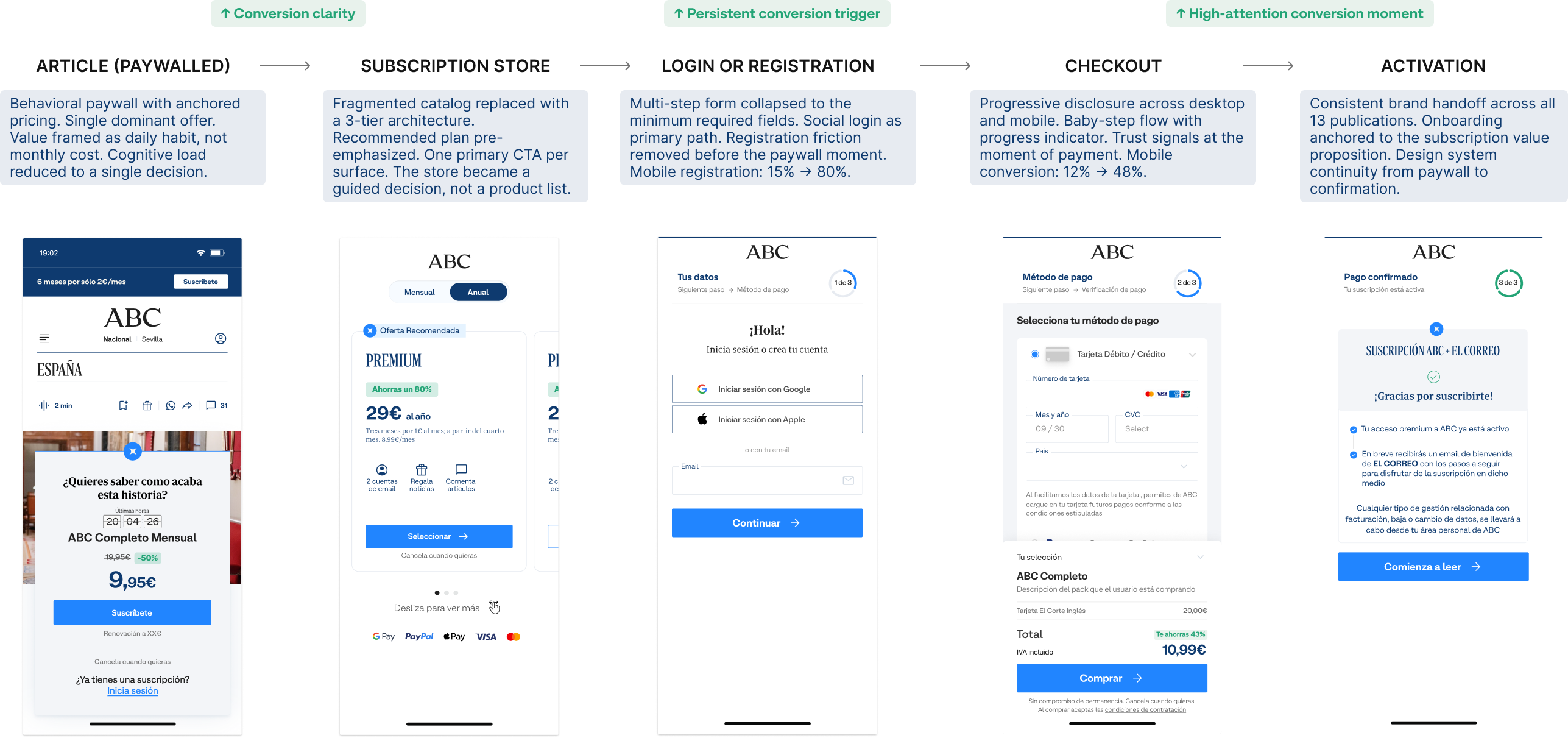
“Less than a coffee a day.”
Older audiences weren’t converting on mobile because monthly pricing felt like a lump-sum commitment. Anchoring the subscription to a familiar daily habit was the highest-performing intervention in the entire test program — across all 13 brands.
The fragmentation was architectural, not visual. Thirteen redesigns would have produced thirteen new inconsistencies within 18 months. The constraint: the solution had to deploy across all brands without any brand team needing to understand the full system. Consistency had to be structural, not enforced.
The same fragmentation under a new visual layer — a guaranteed regression within two product cycles.
No authority to enforce it. It would die on first contact with a regional launch week.
Shared modules, data contracts and a single conversion logic — adopted because it was easier to use than building independently.
| Principle | Problem | Implementation | Impact |
|---|---|---|---|
| Decision simplification | Too many combinations created decision paralysis. | Bundles reduced to 3 core tiers; a clear primary path; one dominant CTA per surface. | Users understand the offer and decide faster. |
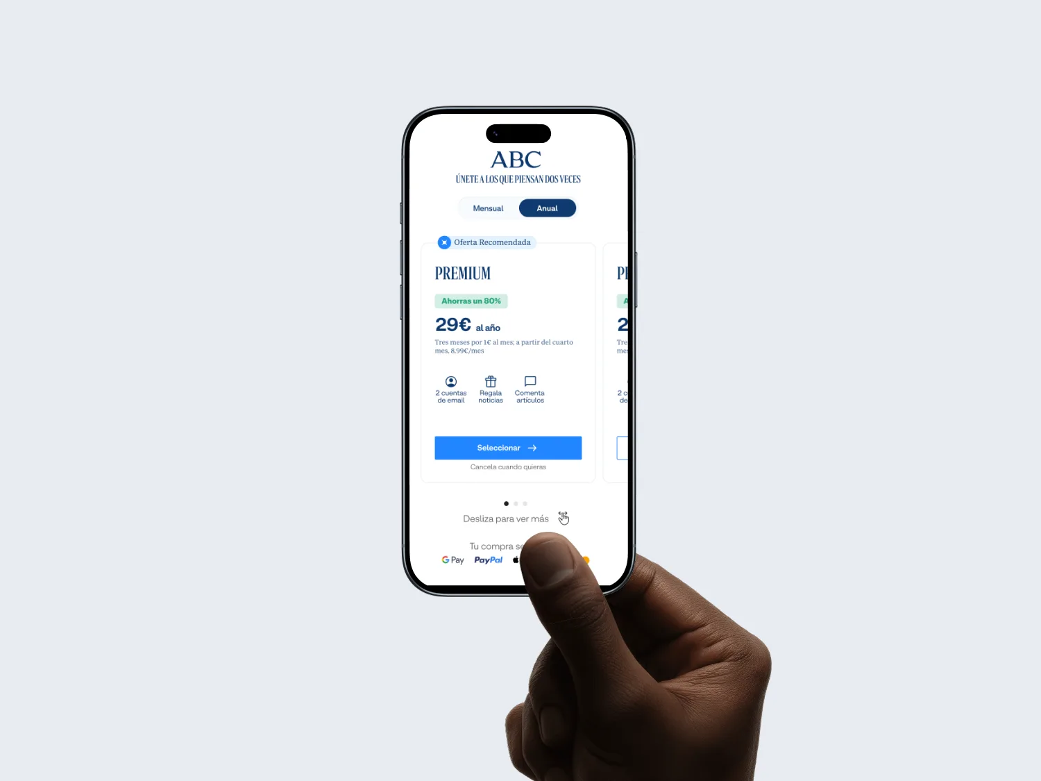
| Visual hierarchy | Attention had no anchor. | Recommended plan highlighted; structured pricing; dominant primary actions. | Users find the best option without scanning the whole page. |
| Choice architecture | Options weren’t structured to support the decision. | Recommended plan pre-emphasized; monthly entry plus annual upgrade; side-by-side comparison. | Choice overload reduced. |
| Scannability | Value proposition not visible at a glance. | Lower text density; offer grouping; bullet-point benefits. | Users evaluate the subscription in seconds, not minutes. |
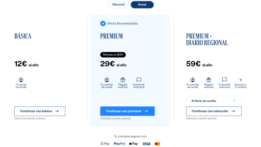
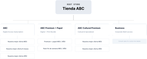
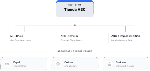
One shared core. Local customization at the surface.
El Correo · Diario Vasco · Diario Montañés · El Comercio · La Rioja · Las Provincias · El Norte de Castilla · Hoy · Sur · Ideal · La Verdad
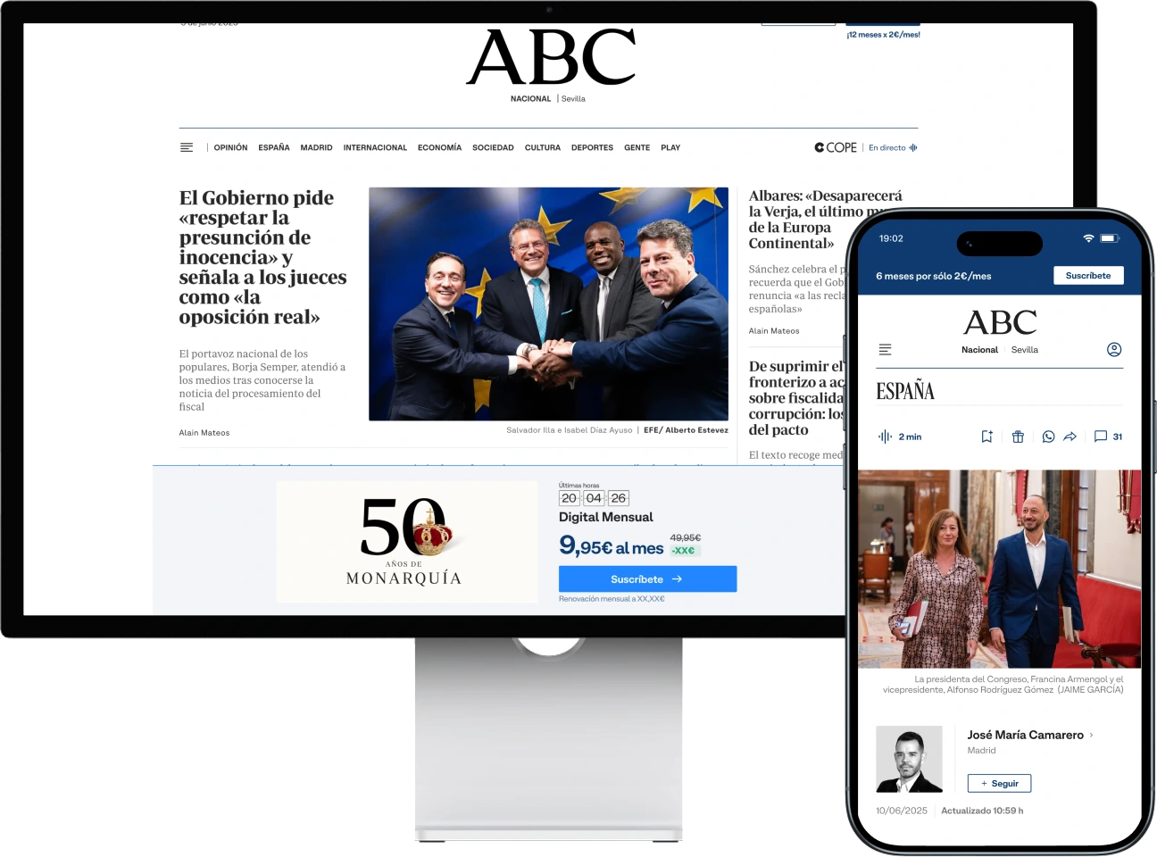
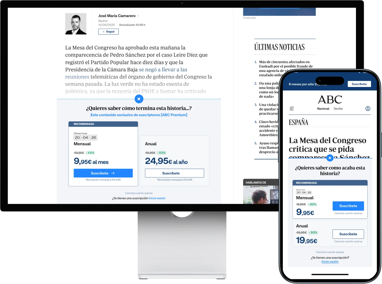
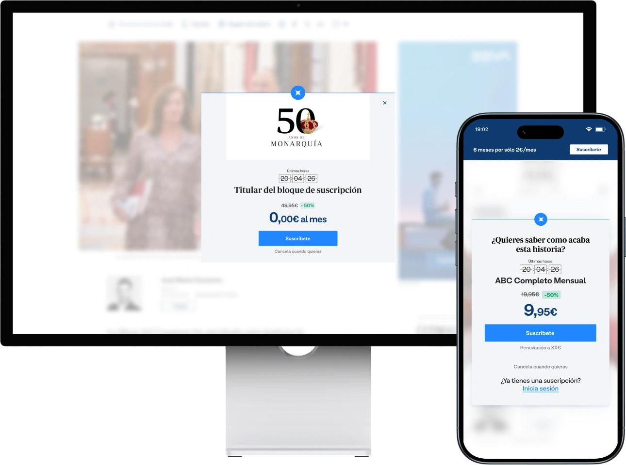
The store was the highest-intent surface and the highest drop-off point. Every element was tied to a decision-theory reference, so each choice could be defended in front of 13 brand teams.
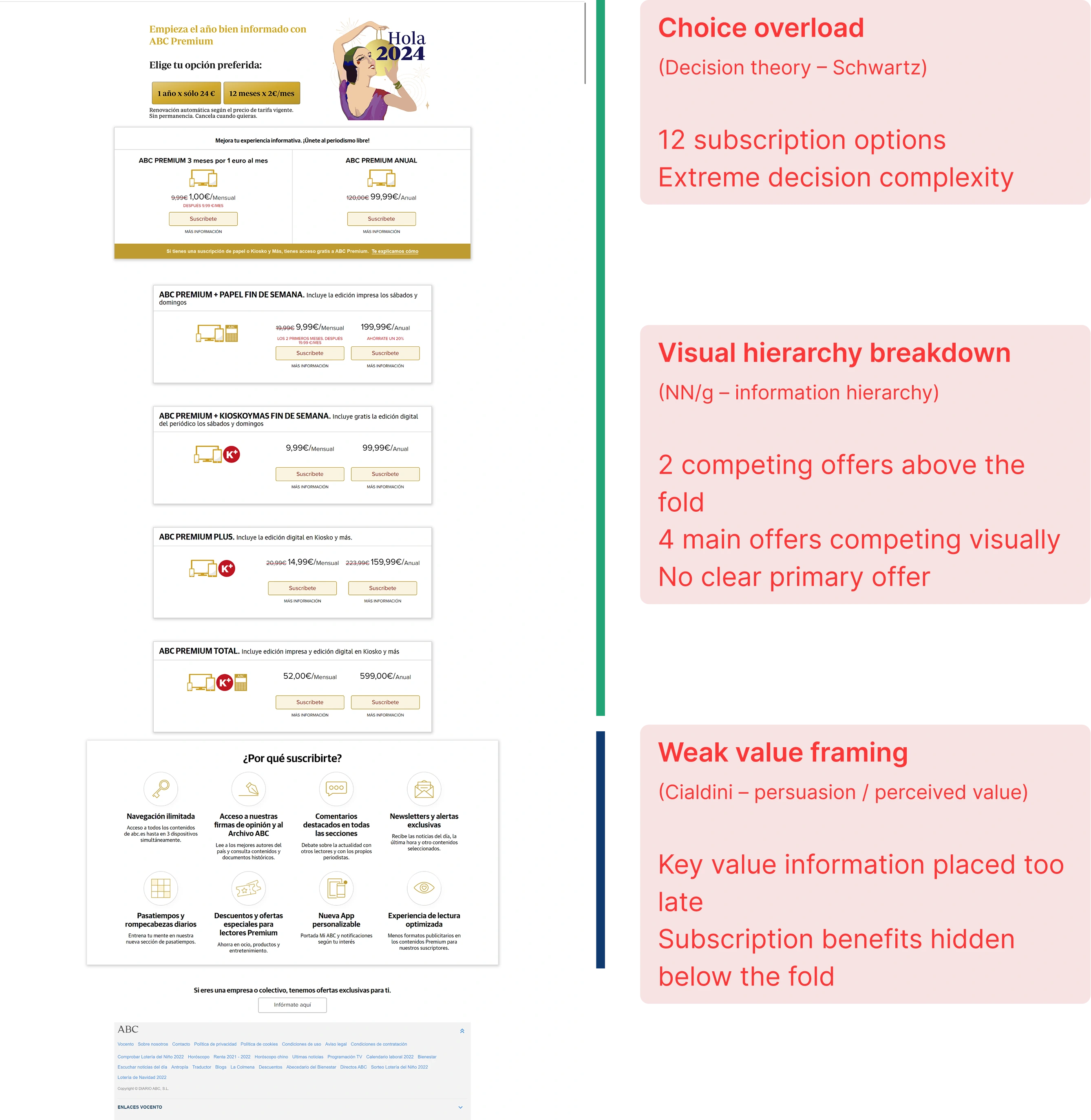
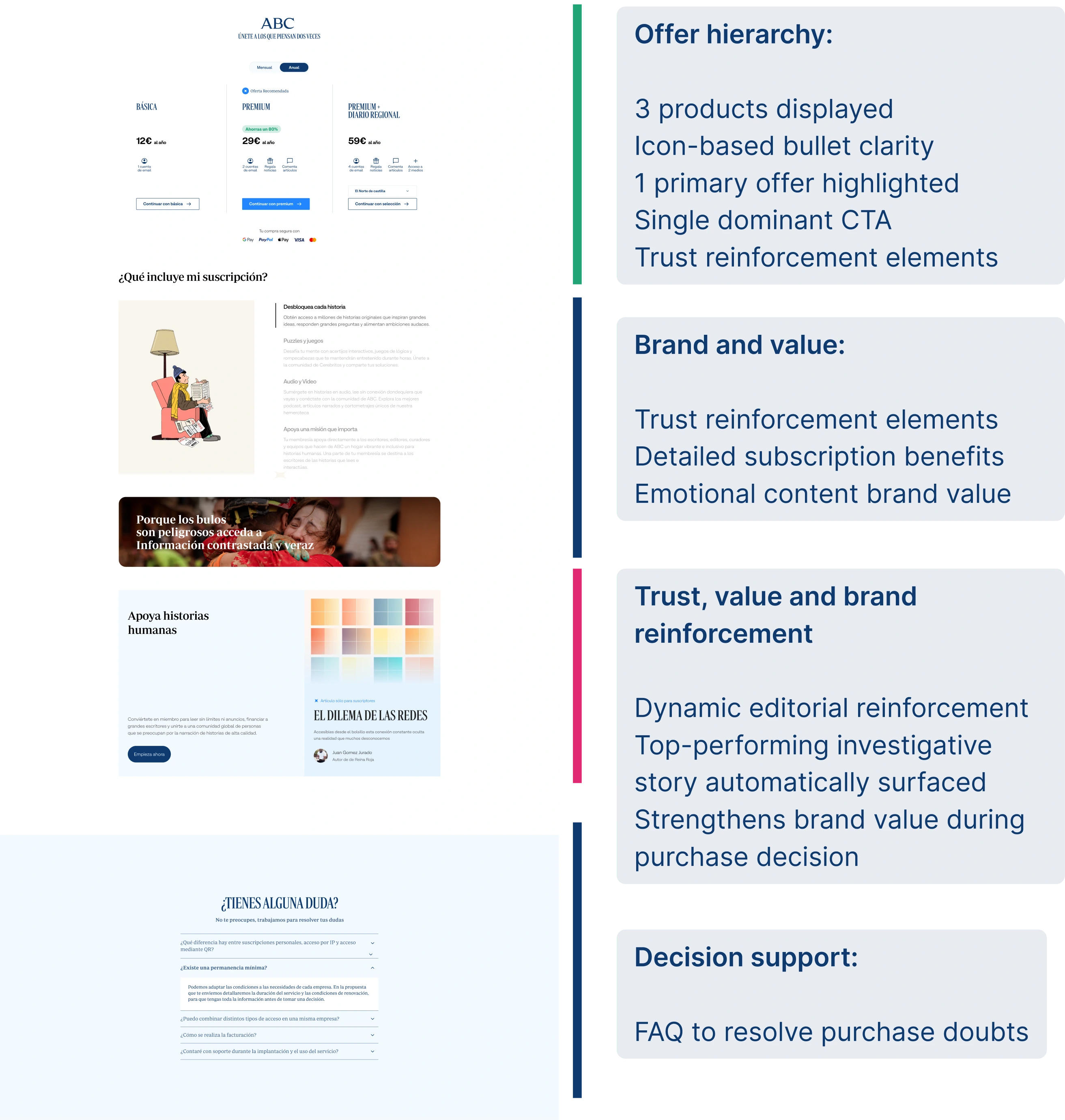
The store stopped being a product catalog and started being a guided decision — the highest-performing conversion surface in the system.
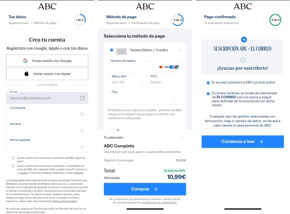
Progressive disclosure: baby steps plus a progress indicator, on desktop and mobile.
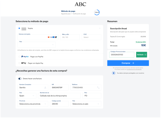
| KPI | Before | After | Reading |
|---|---|---|---|
| Total volume (ABC + Media) | 118,380 · Jun 2023 | 149,493 | +31,113 net subscribers from checkout friction reduction · Feb 2025 |
| ABC volume | 39,115 | 54,461 | +39.2% growth driven by simplified payment flows |
| ARPU (Media) | €110.27 · Jun 2024 | €110.64 | Premium value maintained despite high-volume acquisition |
| Monthly churn (Media) | 5.11% | 4.35% | Net reduction in post-sale friction |
| Monthly churn (ABC) | 4.07% | 3.10% | −23.8% abandonment after the checkout redesign |
| Billing churn (Group) | 3.72% · 2023 | 3.63% | Stabilized across the group · 2024 |
Seven buyer personas per brand modulated the emotional messaging while the framework stayed consistent.
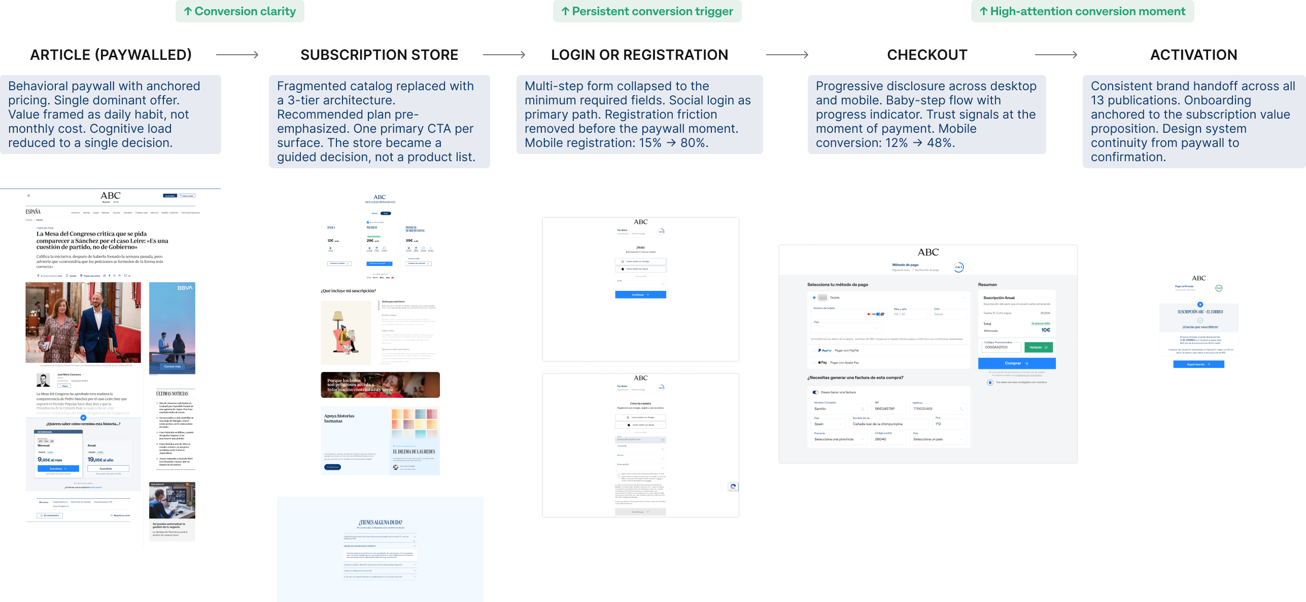
Adoption couldn’t be mandated. The documentation wasn’t peripheral to the work. It was the work. A component without a usage contract is just a suggestion.
Reusable modules, shared tokens and pre-wired tracking.
Inputs, constraints and tracking events per component. Documentation defined what could vary.
A unified tracking layer made experiments comparable across brands from day one.
It’s also every team that has to implement your decisions without you in the room. The highest-leverage work wasn’t the interaction design. It was the constraint definition: deciding what could vary across brands and what couldn’t. That single decision shaped everything that came after.
“Systems don’t fail because of design quality. They fail because the teams implementing them don’t understand the decisions behind them.”
Invest earlier in local adoption champions within each brand team. That knowledge transfer was the bottleneck — not the component quality.