UX/UI · development · SEO · WPO · maintenance · testing.
Case 05 / 06InfrastructureBrandingWeb
Rebranding a cybersecurity company around the one thing it protects: the data.
The old identity looked like the industrial companies around it — pipes, steel, cement. The new one is built from a single idea: a piece of data, moving through a secure channel. From the symbol to the office walls.
- In one line
- One idea — protect the data — carried from the symbol to the colours, the reports, the website and the office glass.
- Client
- Sidertia Solutionscybersecurity
- Year
- 2022
- Role
- Solo projectbrand, UX/UI and web
- Tools
- Figma · Illustrator · Photoshop
- Scope
- Research · rebrand · strategic branding · slogan · content · UX/UI · web development · SEO · WPO · web maintenance · testing · merchandising · office vinyls
00 — The idea
Protect the data.
In the middle of a digital transformation, a company’s main asset is its information. Trust, reputation and credibility depend on how well it is protected — and all three can be lost if the cybersecurity behind it isn’t right. Every decision in this rebrand answers one question: what does a cybersecurity company actually protect? Not servers, not networks — the data.
Context
A security company dressed as a steelworks.
01 — Research
The old brand belonged to another industry.
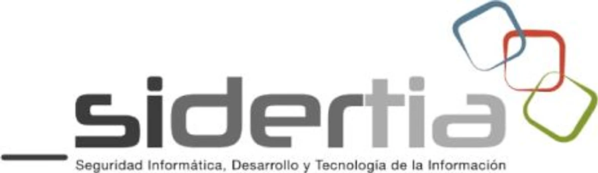
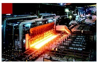
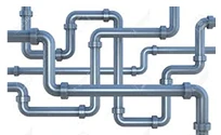
Once the research was done, the problem was obvious: the business context the old brand reflected was industry. It reminded us of tubes, plumbing, cement, metal, steelworks — not of a firm that protects sensitive, qualified and classified information.
The old mark


What it evoked




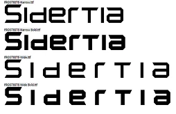
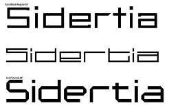
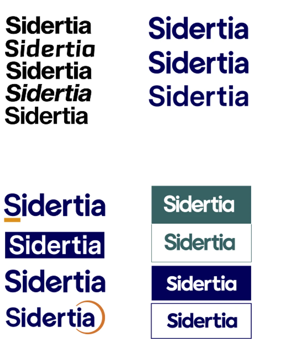
The name, in the typefaces of that world
02 — Competition
A sector that all looks the same.
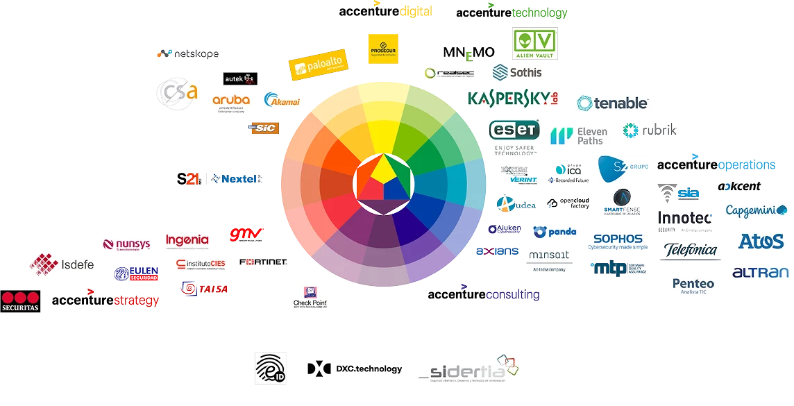
Then the landscape it had to stand in: the cybersecurity sector, mapped around a colour wheel. Most of the field crowds into the same reds and blues.
“Protege tu Dato.”Protect your data — the line the whole system is built to say.
The brand
Exploration, the mark, the values — then the symbol: a datum, a channel, a secure environment.
03 — Exploration
Looking for the S.
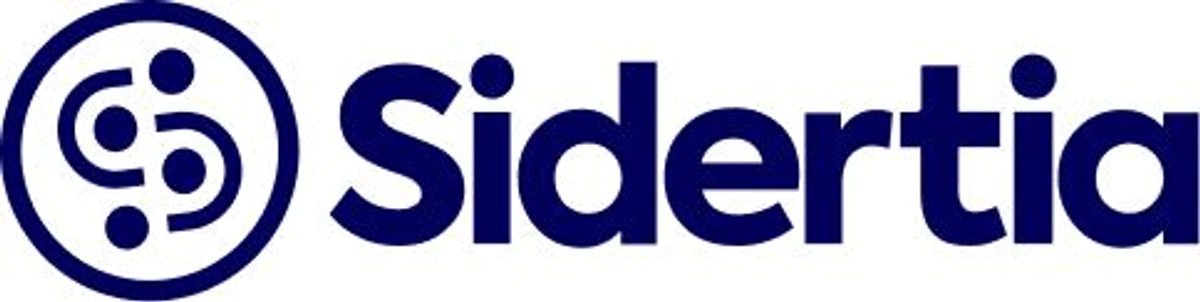
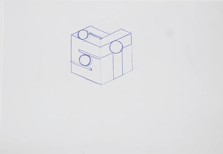
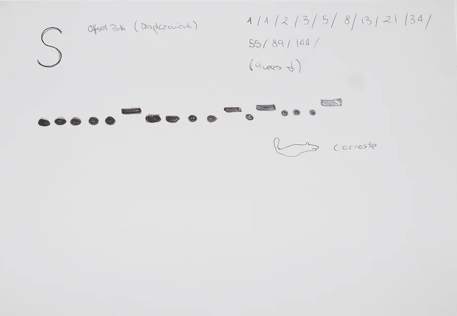
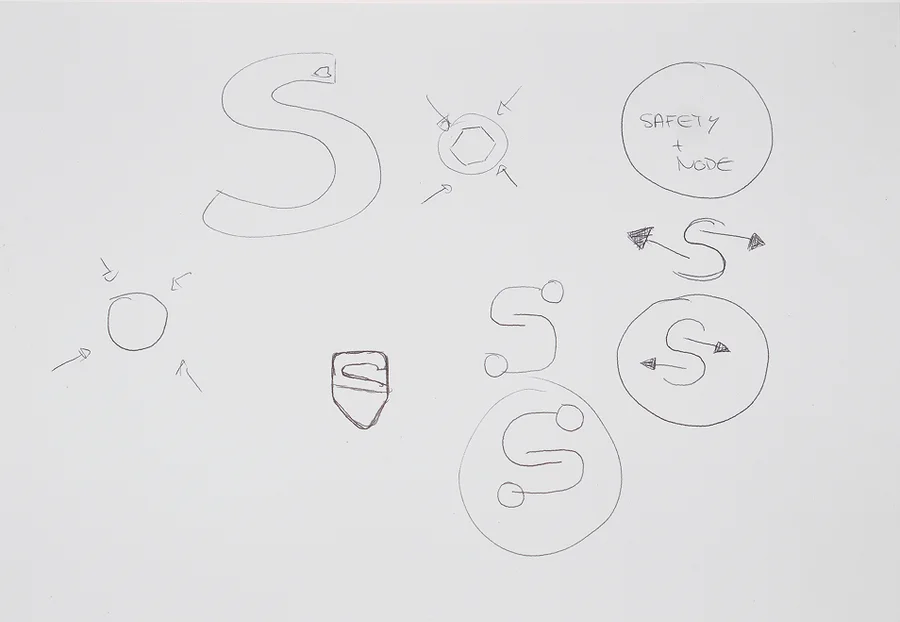
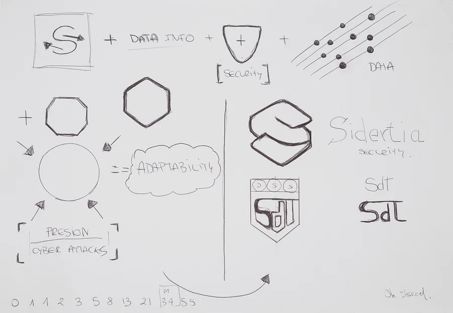
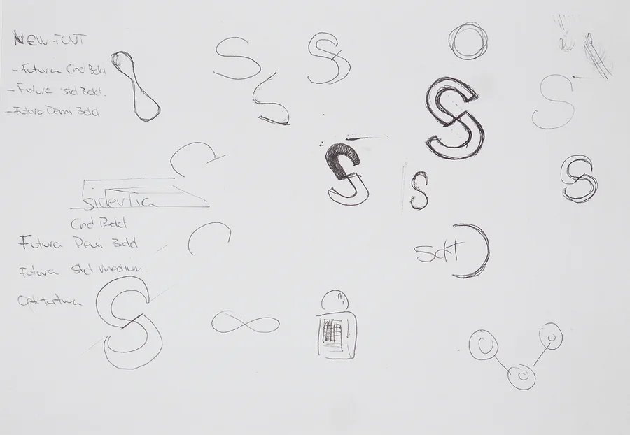
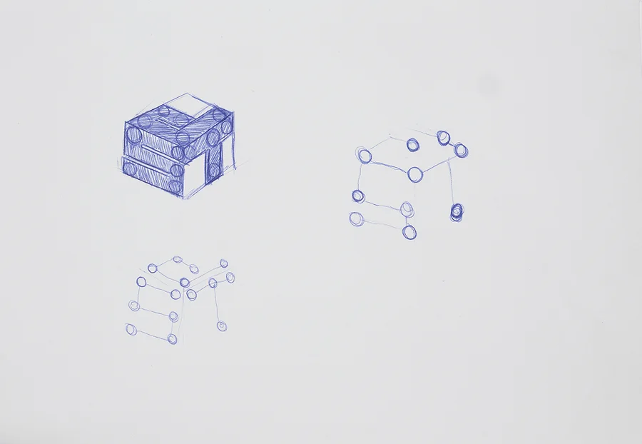
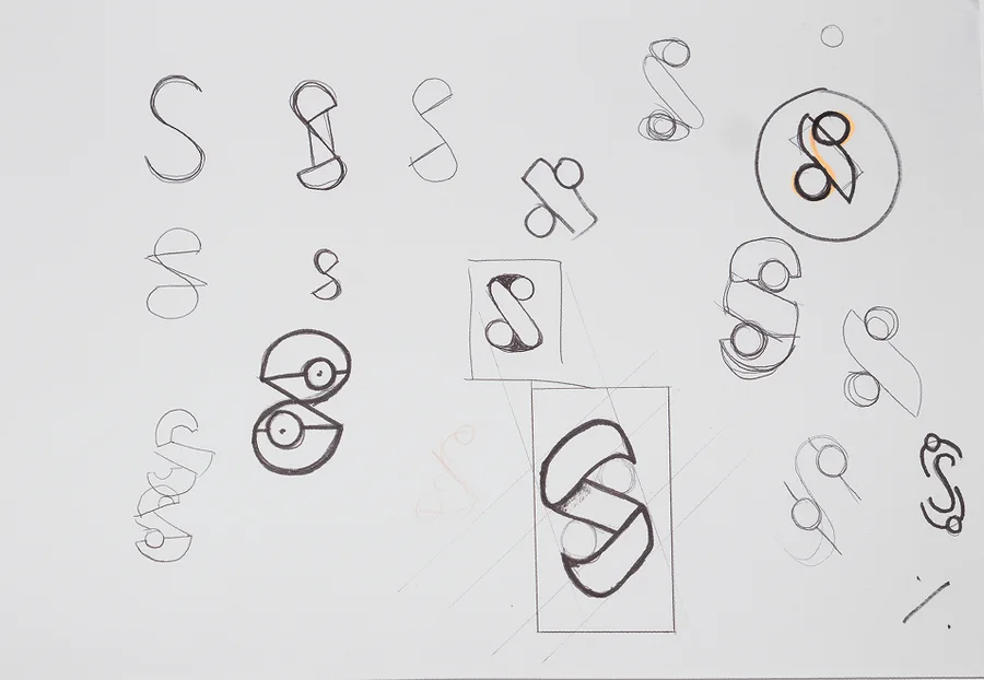
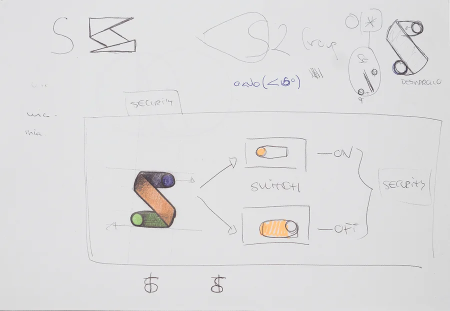
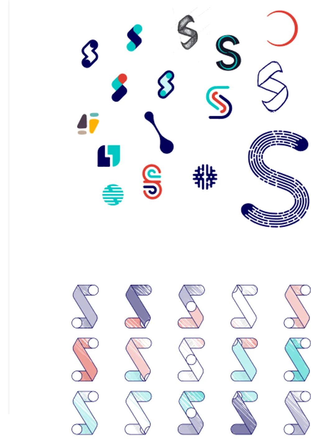
It started on paper: twelve pages of S shapes, padlocks, channels and dots before anything touched a screen. Then the name was tried in several weights and lockups, and the symbol as dozens of S shapes — and as a ribbon, an S that folds over itself like a path.
Sketchbook · twelve pages, in the order they were drawn
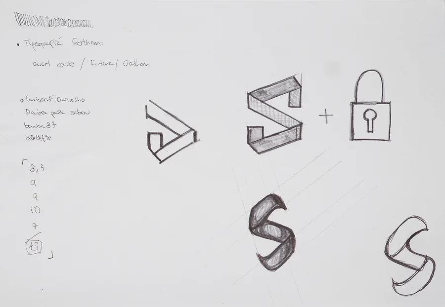
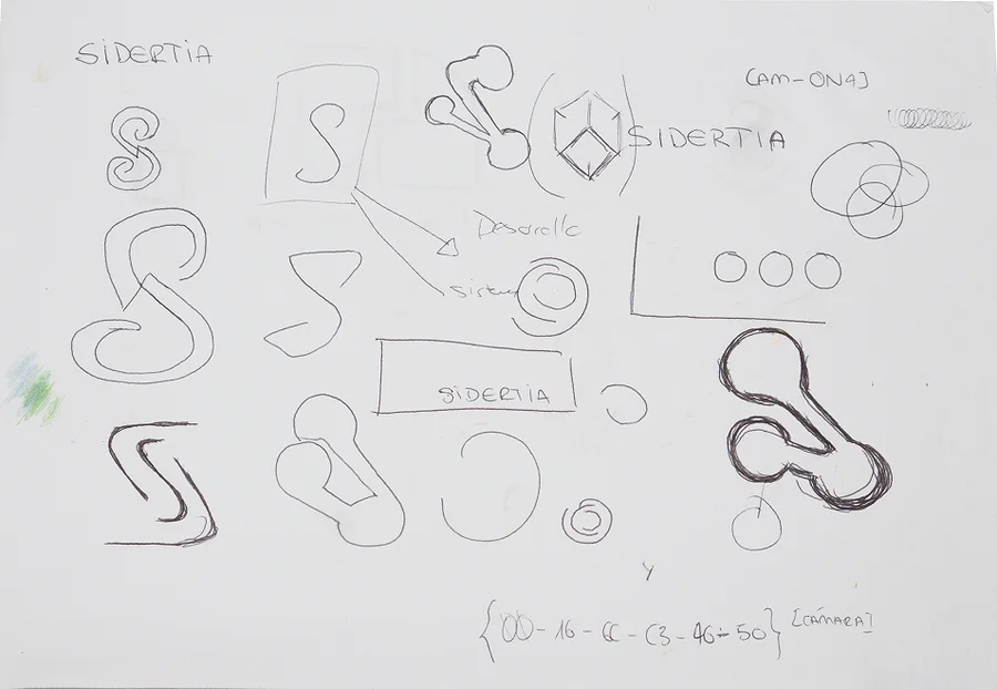
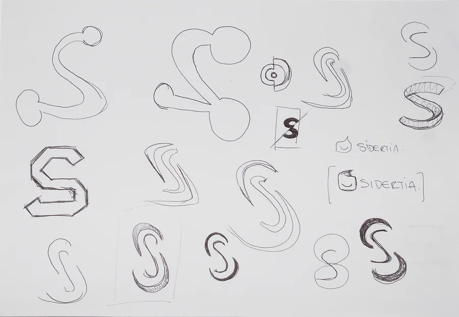
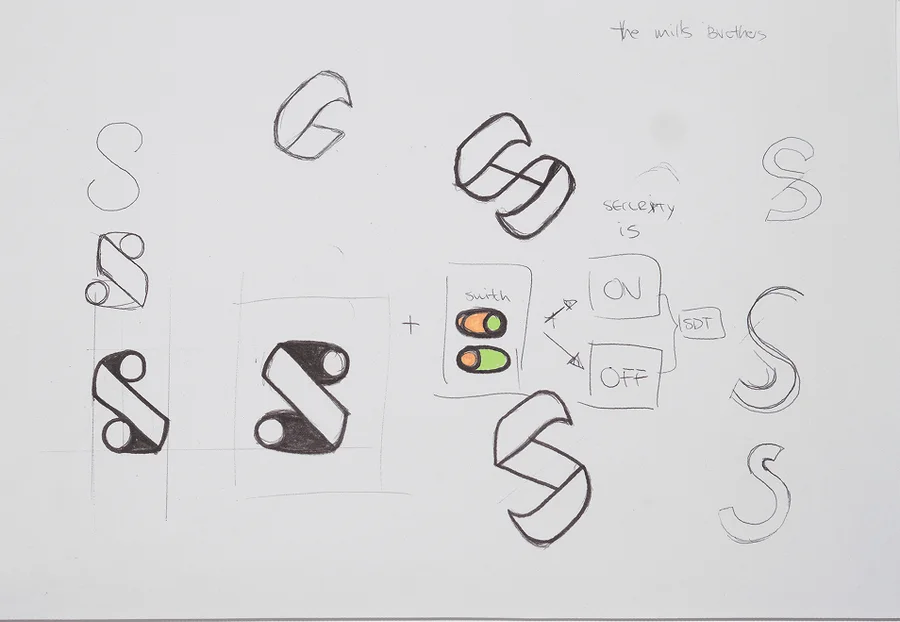
 01 / 12
On screen
04 — The mark
An open S: a path with a beginning and no end.
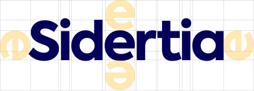
The wordmark is set in Axiforma, chosen for its proportion and legibility at low resolutions and for the rounded forms that soften the angular parts — faster to read, more sincere, more trustworthy. Its construction follows golden proportions.
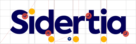
The S is an open letter with two entries, so both ends were cut at 34° to give it character and a sense of openness: an analogy for a path, a route, a way of working with a beginning but no end.
The S34°Cut at both ends
05 — Values
Four values, drawn with the symbol’s own parts.
The core values became four pictograms built from the same primitives the symbol is made of — a bar, a dot, a cluster, a ring.
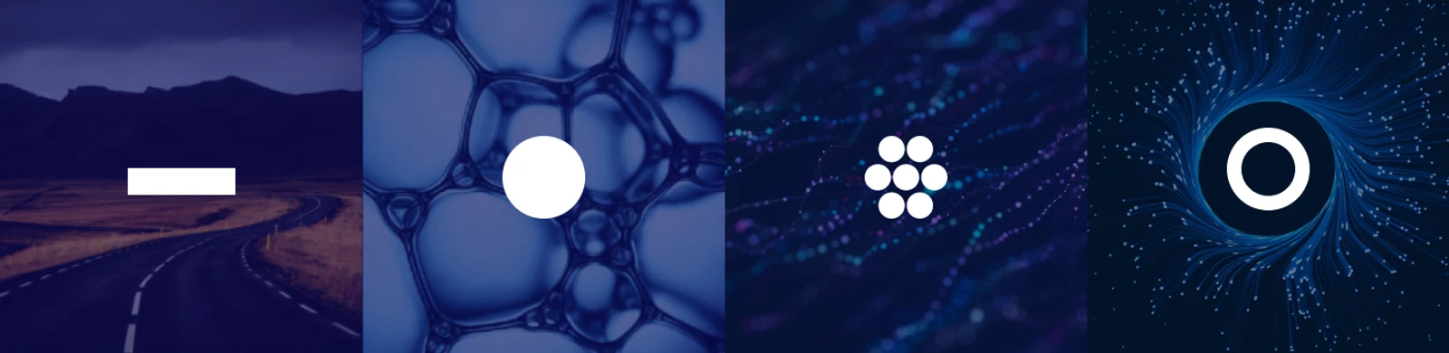
Leadership · trustAdaptationTransformation · fortificationSolidity · security
“Coordinating efforts and solutions, accompanying public and private clients with an integral view of information protection, in continuous improvement.”
06 — The symbol
A datum, a channel, a secure environment.
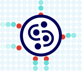
The figure represents data travelling across the internet: dots moving through a communication channel between senders and receivers, a magnetism of circles and lines — all inside a closed, secure channel drawn as the containing circle.
Drawing it · every construction phase, to the final isotype
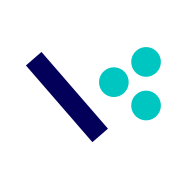

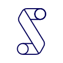

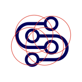





Reading it · four ideas, one symbol
Living it · the datum, the channel, the secure environment


07 — Colour & type
Abyssal blue, ocean green, snow white.
Three primaries, each taken from an image of the planet — the abyss, the ocean, the snow — and four secondaries for the data dots that move through the system. The colours are places on Earth, because data has to cross all of them. Tap a colour to copy it.
Branding · Axiforma Bold / Semibold The brand typeface — shown outlined, never loaded as a webfont.
Titles · subtitles · text · Montserrat Interface and reading.
Web
Designed, built and kept alive.
08 — Web
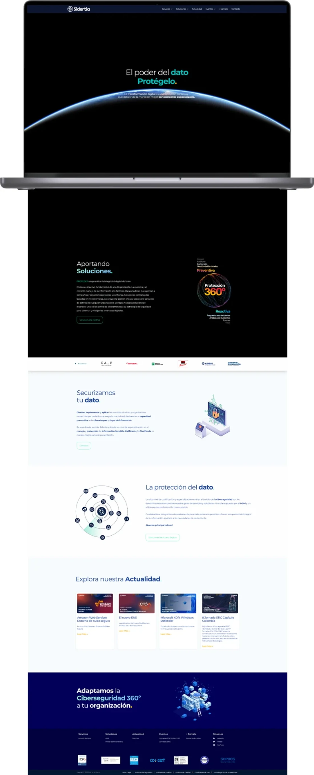
“El poder del dato. Protégelo.”
Designed and built end to end — UX/UI, development, SEO, performance and maintenance. A careers portal and a cybersecurity icon set came from the same system.
Scope
Careers portal · icon set
Line icons for GDPR, audits, access control and threats — drawn for the services the company sells.
Type
Axiforma for the brand, Montserrat for the interface.
Applications
Content and print, one system.
09 — Content
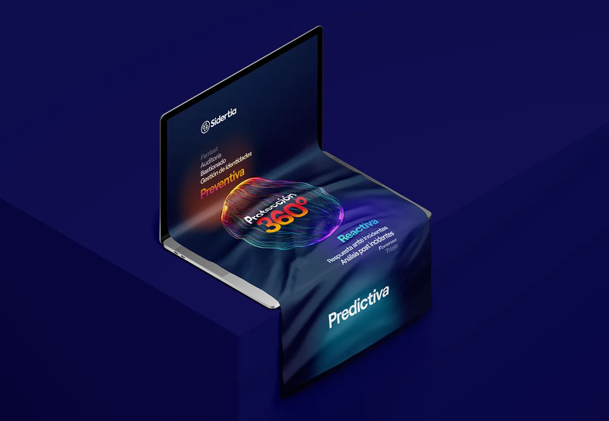
Preventive, reactive, predictive.
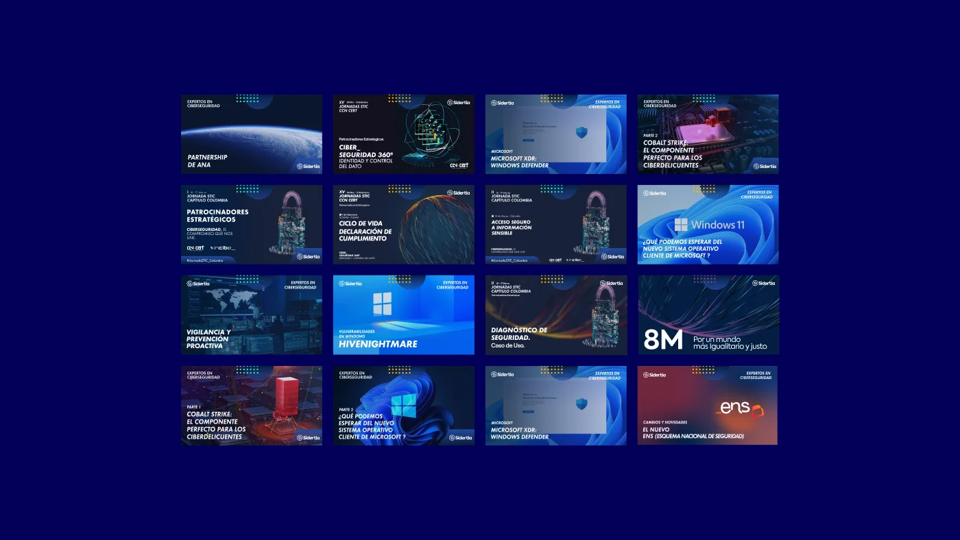
Social posts, events and the Protección 360° offer — preventive, reactive, predictive — all carried by the same field of coloured light lines.
10 — Print
Posters, cards, folders, reports, merchandising.
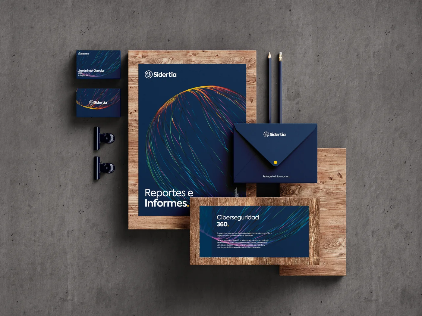
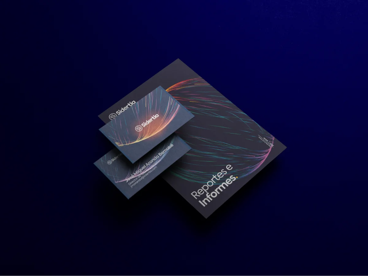
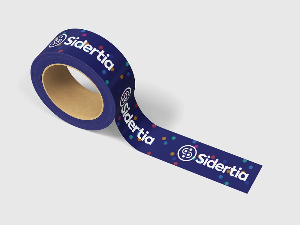
One system on paper and objects: the light lines on the reports and folders, the data dots on the merchandising.
Space
The office as the last application.
11 — Office vinyls
The office is the method.
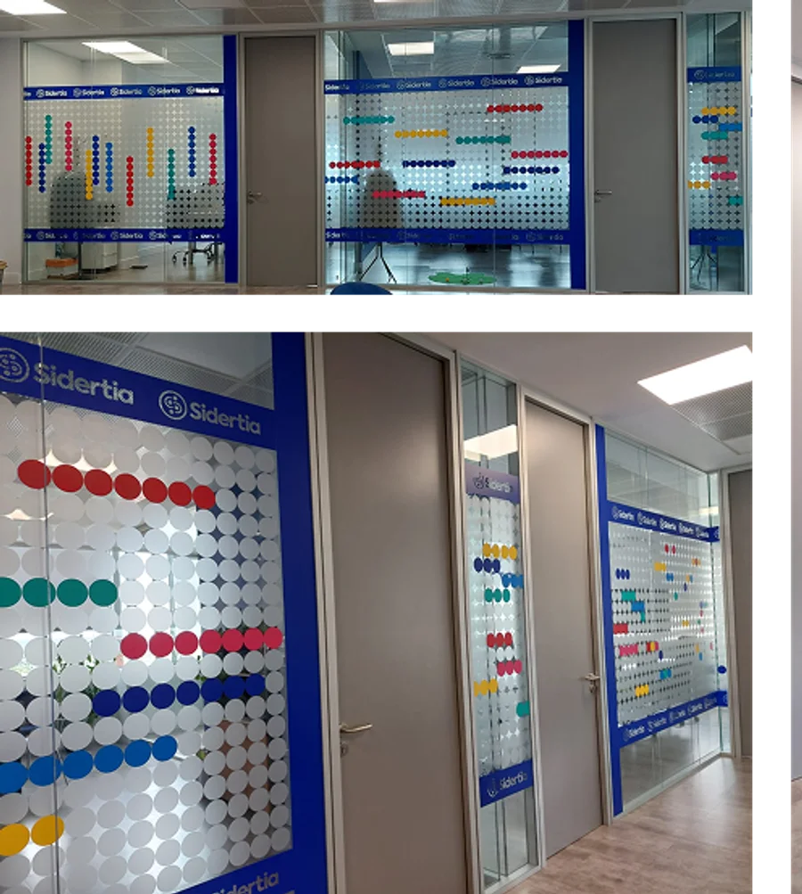
The vinyls aren’t decoration — they’re the route. They follow the rooms of the office in the order a client walks through them, and the dots in each room say what happens there: the client arrives with a disordered problem, the technicians package it, and management decides.
Room 01Operations
Walk the office and you’ve walked the method.
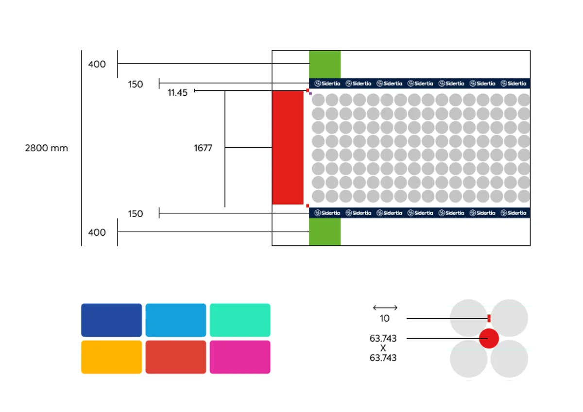
Final artwork · how the vinyl was specified for production
Installed
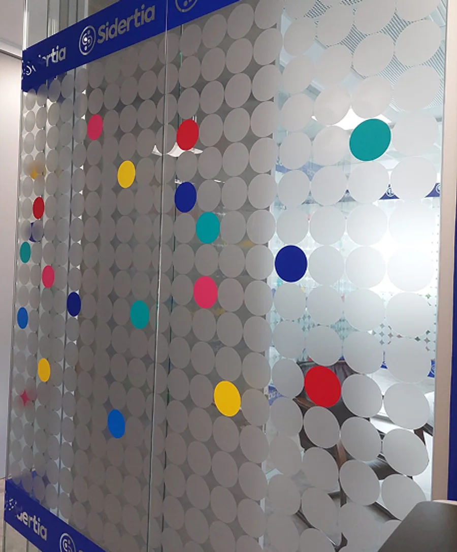
One idea, everywhere: protect the data.