VIABILITY
Business
Subscription growth stagnated despite strong traffic. Mobile conversion was critically low. Launching a new offer required weeks of dev coordination, slowing every experiment the growth team wanted to run.
CASO DE ESTUDIO → SISTEMA DE CONVERSIÓN CONDUCTUAL
13 marcas. Cero arquitectura compartida. Cada cambio exigía coordinar equipos sobre los que nadie tenía autoridad.
Un sistema de conversión conductual en la intersección entre arquitectura UX, diseño de producto e ingeniería.

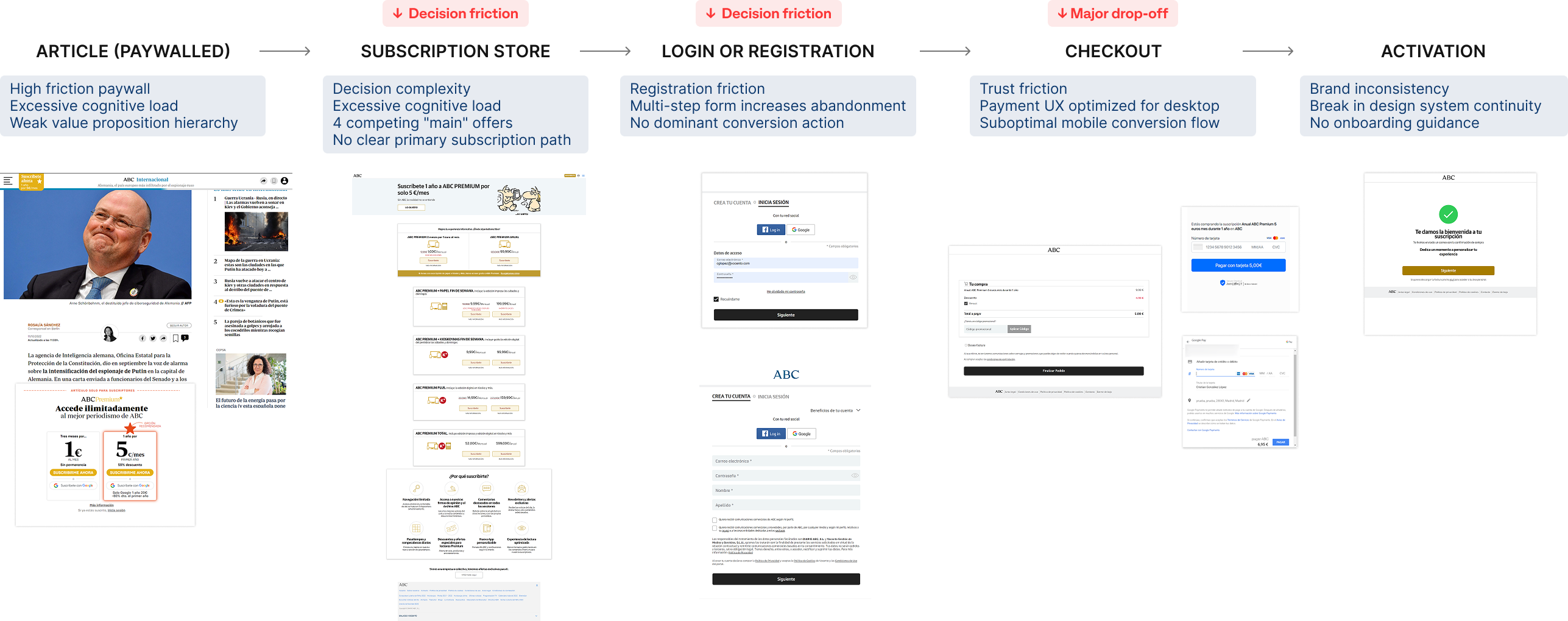
01 — EL RETO
Vocento opera 13 marcas informativas en tres grupos editoriales. Cada marca había construido su propia experiencia de suscripción adaptando componentes de otras marcas del grupo — y después adaptando esas adaptaciones.
El resultado: un ecosistema de código fragmentado, patrones de UX inconsistentes y funnels de conversión que nadie entendía del todo ni podía modificar con seguridad. Cada cambio exigía coordinar a varios equipos de desarrollo. Cada experimento corría el riesgo de romper marcas adyacentes.
El modelo de suscripción generaba ingresos a pesar de sí mismo — no por existir un sistema coherente.
Todo el mundo sabía que el funnel estaba roto. Nadie tenía la autoridad — ni la arquitectura — para arreglarlo sin poner en riesgo lo que ya funcionaba.
Tres ecosistemas editoriales. Trece marcas. Cero arquitectura compartida.
02 — EL DIAGNÓSTICO
Before redesigning anything, we instrumented the funnel. 10,000+ users tested. Continuous A/B experimentation across brands. What we found wasn't a design problem — it was a coordination problem manifesting as a UX problem.
VIABILITY
Subscription growth stagnated despite strong traffic. Mobile conversion was critically low. Launching a new offer required weeks of dev coordination, slowing every experiment the growth team wanted to run.
DESIRABILITY
Decision paralysis from poorly structured plans. Long, confusing login, registration and checkout flows. Multiple landing pages eroded trust at payment. Subscription value was framed as a transaction, not a premium content experience.
FEASIBILITY
No shared conversion framework. Each team implemented the funnel differently. Components were reused informally without contracts. Experiments couldn't be scaled across brands because no two brands measured the same thing.
02 — EL DIAGNÓSTICO
Three friction points accounted for nearly all the drop-off: the paywall (too many options), registration (too many fields), and checkout (too many steps). The same pattern across all 13 brands.
Subscription decision journey Baja escaneabilidad, jerarquía débil y rutas de decisión complejas introducían fricción en cada etapa del funnel.
Winning behavioral insight
Older audiences weren't converting on mobile because monthly pricing felt like a lump-sum commitment. Anchoring the subscription to a familiar daily habit was the highest-performing intervention in the entire test program — across all 13 brands.
03 — LA DECISIÓN
The obvious move was to redesign each brand's subscription experience independently. We had the briefs, the brand guidelines, the stakeholder buy-in. We chose not to. Fragmentation wasn't a visual problem — it was architectural.
Thirteen separate redesigns would have produced thirteen new inconsistencies within 18 months, as each team adapted the new components the same way they'd adapted the old ones. The constraint we set: any solution had to be deployable across all brands without a single brand team needing to understand the full system. Consistency had to be structural, not enforced.
RULED OUT
Would have reproduced the same fragmentation under a new visual layer. Short-term wins, long-term drift. The cost of coordination across teams made this a guaranteed regression within two product cycles.
RULED OUT
No authority to enforce it. Brand teams had their own roadmaps and their own editorial calendars. Any solution depending on compliance would die on first contact with a regional launch week.
COMPROMETIDOS CON
One system, adopted because it was easier to use than building independently. Structural consistency through shared modules, data contracts and a single conversion logic — not through enforcement or policy.
04 — EL SISTEMA · PRINCIPIOS
One shared architecture that 13 teams could implement without breaking each other. Four principles governed every component in the system.
Problem
Too many subscription combinations created decision paralysis.
Implementation
Reducción de múltiples bundles a 3 niveles clave
Clear primary subscription path
Single dominant CTA per surface
Impact
Los usuarios entienden la oferta y deciden más rápido.
Problem
Attention had no anchor. Everything competed visually.
Implementation
Recommended plan highlighted
Structured pricing hierarchy
Visually dominant primary actions
Impact
Los usuarios identifican la mejor opción sin escanear toda la página.
Problem
Las opciones estaban estructuradas sin ayudar a la decisión.
Implementation
Recommended plan pre-emphasized
Monthly entry point + annual upgrade
Clear side-by-side comparison
Impact
Choice overload reduced. Decision path clarified.
Problem
La propuesta de valor no se veía de un vistazo.
Implementation
Reduced text density
Clear offer grouping
Bullet-based benefit lists
Impact
Los usuarios evalúan la suscripción en segundos, no en minutos.
04 — EL SISTEMA · ARQUITECTURA
The subscription catalog was collapsed into a three-tier model shared across the ecosystem. Cognitive load dropped. Experimentation scaled. A single architecture governed all 13 brands.
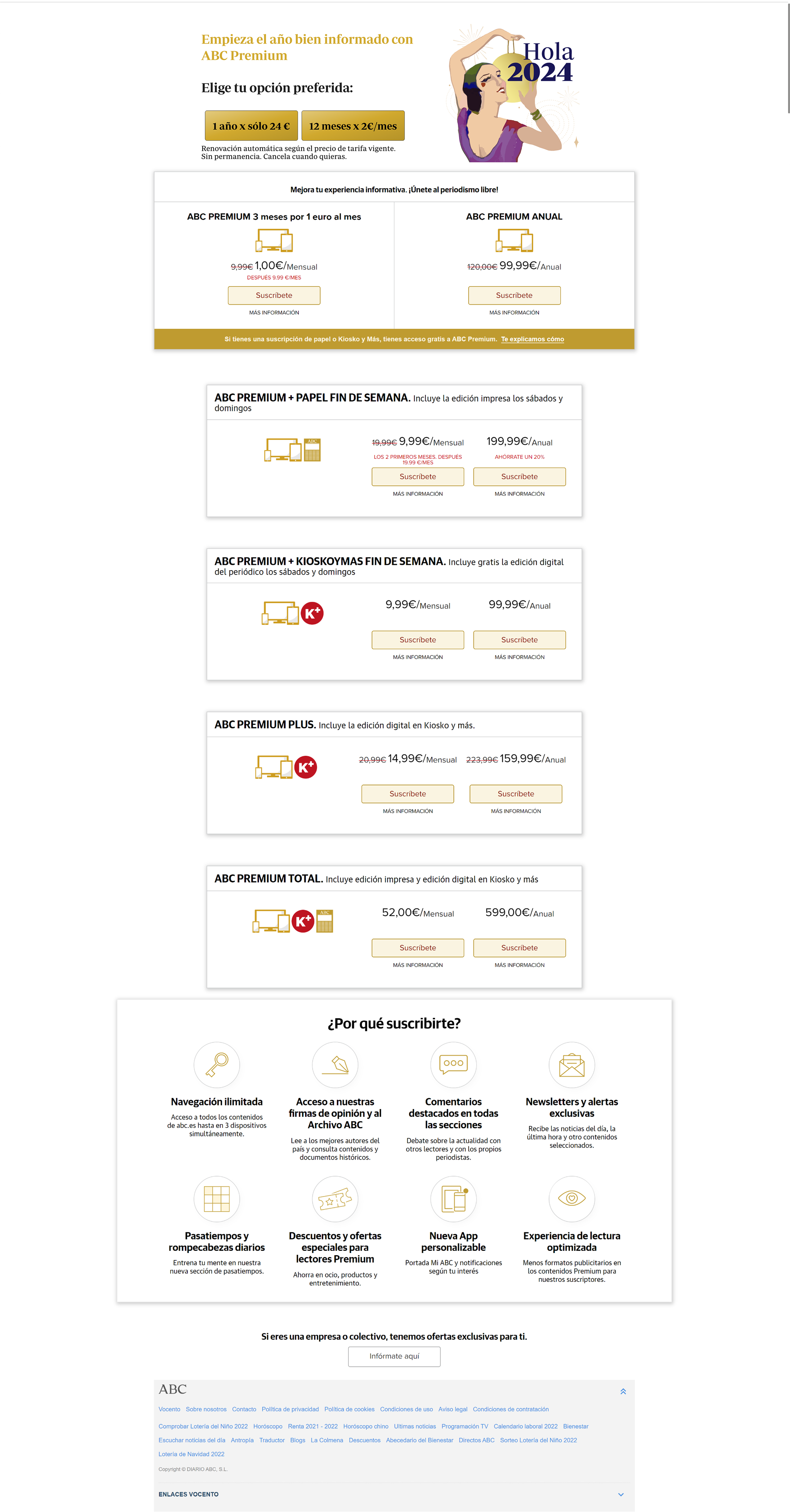
La tienda anterior presentaba muchas variaciones sin una estructura clara. Sin jerarquía visual. Sin escaneabilidad. Sin priorización de oferta. La carga cognitiva hacía la decisión de compra innecesariamente compleja.
La arquitectura rediseñada transformó la tienda de un catálogo de producto a una experiencia de decisión guiada. Un modelo simplificado de tres niveles redujo la carga cognitiva y reforzó la percepción de valor en el momento de decidir.
El nuevo modelo unificó periodismo nacional y regional en una estructura única y coherente.
Acceso al contenido esencial de periodismo digital.
Acceso digital ampliado con investigación, archivos y beneficios exclusivos para suscriptores.
Acceso digital premium combinado con la suscripción a un periódico regional.
Un único nivel que unificó lo nacional y lo regional, redujo la fragmentación de producto y habilitó un sistema consistente en todo el grupo.
Learning
A unified tier model turned scattered subscription implementations into a single platform. Users got clearer decisions. The business got scalable subscription management across the ecosystem.
04 — EL SISTEMA · ECOSISTEMA
El bundle regional integró los periódicos locales de Vocento dentro de la misma arquitectura de suscripción. Los suscriptores podían combinar ABC con cabeceras regionales — El Correo, Diario Vasco, Diario Montañés, El Comercio, La Rioja, Las Provincias, El Norte de Castilla, Hoy, Sur, Ideal y La Verdad.
La plataforma se desplegó en todas las cabeceras. Un núcleo compartido. Personalización local en la superficie. Cada equipo de marca obtuvo la misma base, con capacidad de adaptar tono y mensajes sin tocar la arquitectura subyacente.
El bundle regional permitía combinar ABC con periódicos locales seleccionados, creando una suscripción nacional‑regional unificada. Contenido nacional flagship más periodismo regional de confianza — mayor valor percibido y preservación de la identidad editorial.
La arquitectura de suscripción escaló a todo el ecosistema multi‑marca de Vocento, integrando publicaciones nacionales y regionales en la misma plataforma mientras cada marca mantenía su identidad editorial y su foco de audiencia.
04 — EL SISTEMA · COMPONENTES
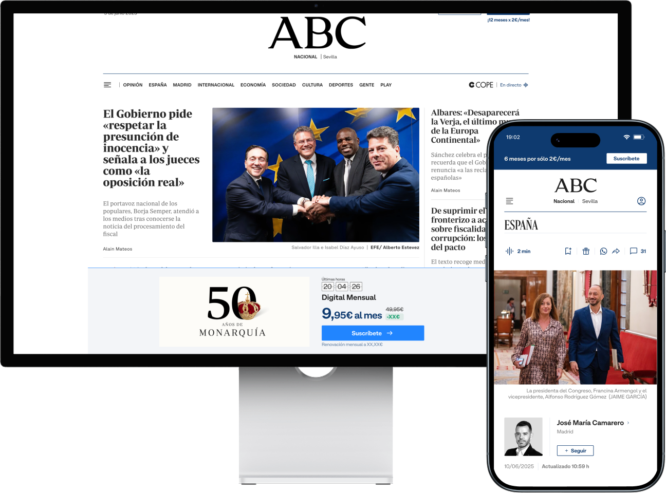
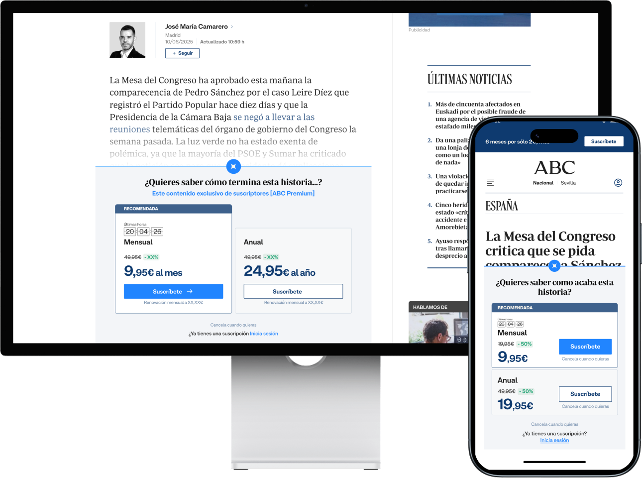
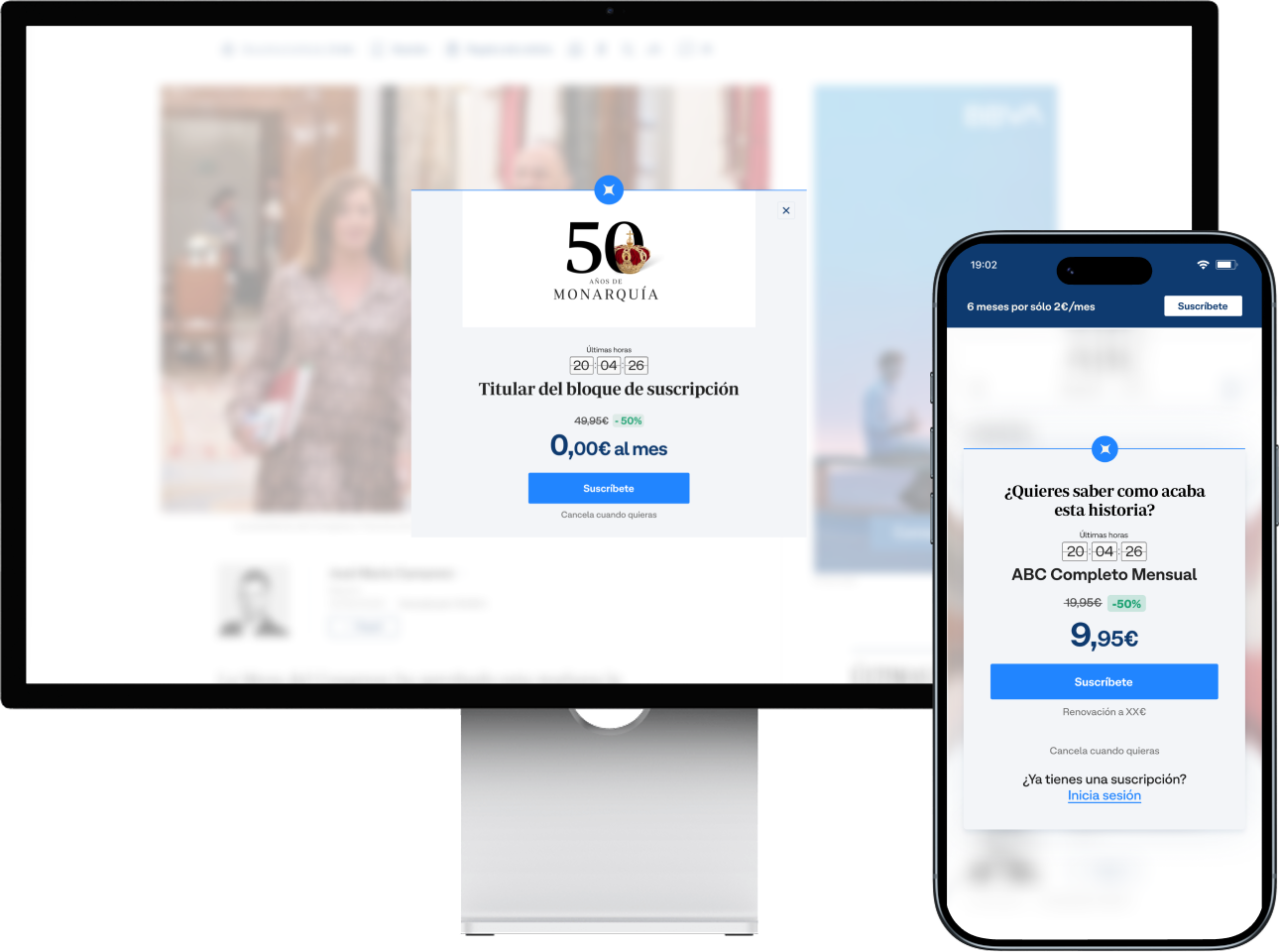
The subscription experience was built as a behavioral conversion system composed of coordinated entry points across the reading journey. Each component addresses a different conversion moment: persistent trigger, decision moment, or high-attention interruption.
Un disparador de conversión de baja fricción que acompaña la lectura. Visibilidad continua de la suscripción sin interrumpir el consumo del artículo.
Rediseñado para simplificar la toma de decisiones y crear una jerarquía de oferta clara. En lugar de combinaciones fragmentadas, un conjunto simplificado de planes estructurados para comparar rápido.
Diseñado como un momento de conversión focalizado dentro del flujo de lectura. A diferencia del banner persistente, el pop‑up concentra la atención en una única oferta y elimina carga cognitiva.
04 — EL SISTEMA · TIENDA
La tienda era la superficie de mayor intención y también el mayor punto de caída. Su estructura fragmentada era el mayor bloqueador de la conversión a suscripción en todo el ecosistema.
El rediseño se apoyó en research conductual: arquitectura de elección, jerarquía de información y valor percibido. Cada elemento se vinculó a un marco de teoría de decisión — porque todo tenía que ser defendible ante 13 equipos de marca.
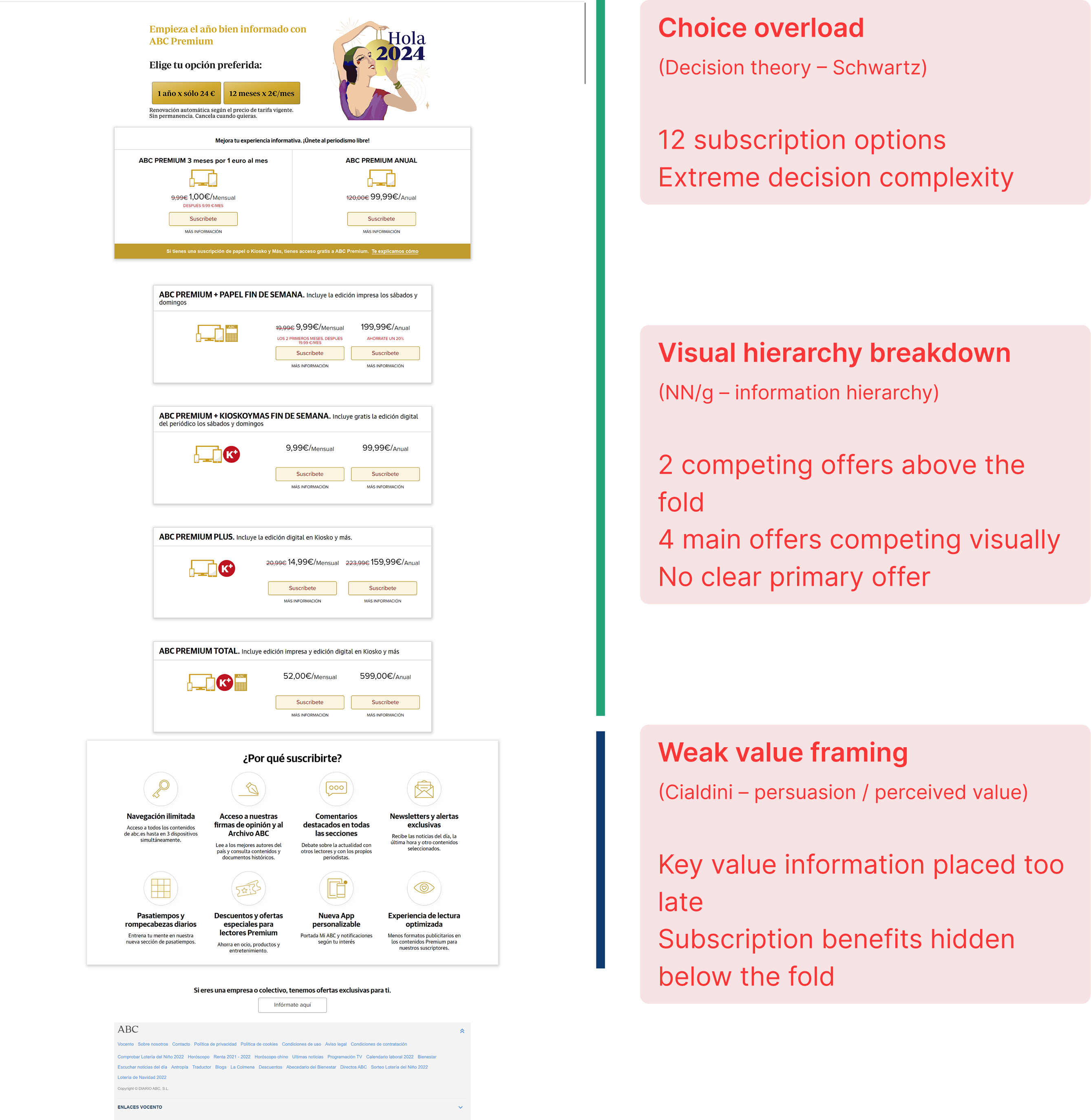
Demasiadas opciones sin una jerarquía clara. Múltiples ofertas competían por atención. La carga cognitiva hacía la decisión de compra innecesariamente compleja.
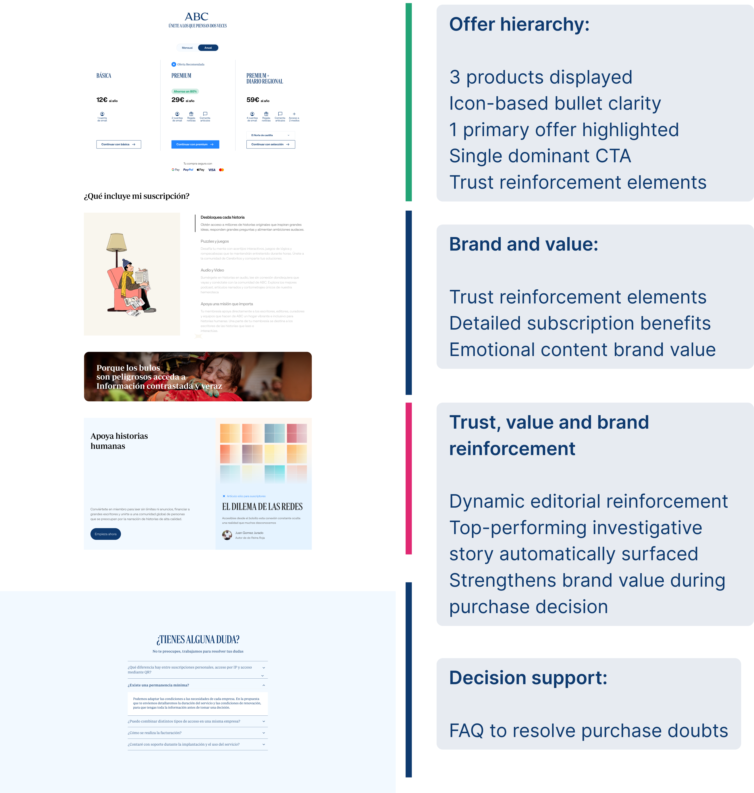
Jerarquía clara. Estructura escaneable. Énfasis visual fuerte. Contenido editorial de alto rendimiento mostrado en el momento de decidir para reforzar el valor percibido.
Learning
The store stopped being a product catalog and started being a guided decision. Scannability, hierarchy and editorial reinforcement turned the page into the highest-performing conversion surface in the system.
04 — EL SISTEMA · PAGO
Checkout was the point of highest conversion intent and the point of highest drop-off. Progressive disclosure across desktop and mobile reduced cognitive load at the exact moment users decided whether to trust the transaction.


Total volume (ABC + Media)
149,493
+31.113 suscriptores netos por reducción de fricción en el checkout
ABC volume
54,461
+39.2% growth driven by simplified payment flows
ARPU (Media)
€110.64
Premium value maintained despite high-volume acquisition
Monthly churn (Media)
4.35%
Net reduction in post-sale friction
Monthly churn (ABC)
3.10%
−23.8% abandonment rate after checkout redesign
Billing churn (Group)
3.63%
Estabilizado en todo el grupo bajo un sistema unificado
04 — EL SISTEMA · FUNNEL UNIFICADO
Un único funnel de conversión — artículo → tienda → login → checkout → activación — compartido por las 13 marcas. Cada equipo tuvo la misma base, con capacidad de adaptar tono y mensajes sin tocar la arquitectura subyacente.
Siete buyer personas por marca modulaban el mensaje emocional mientras el marco permanecía consistente. La consistencia era estructural, no impuesta.
Sistema de conversión unificado Journey de cinco etapas con patrones de UI compartidos, desde el paywall del artículo hasta la activación.
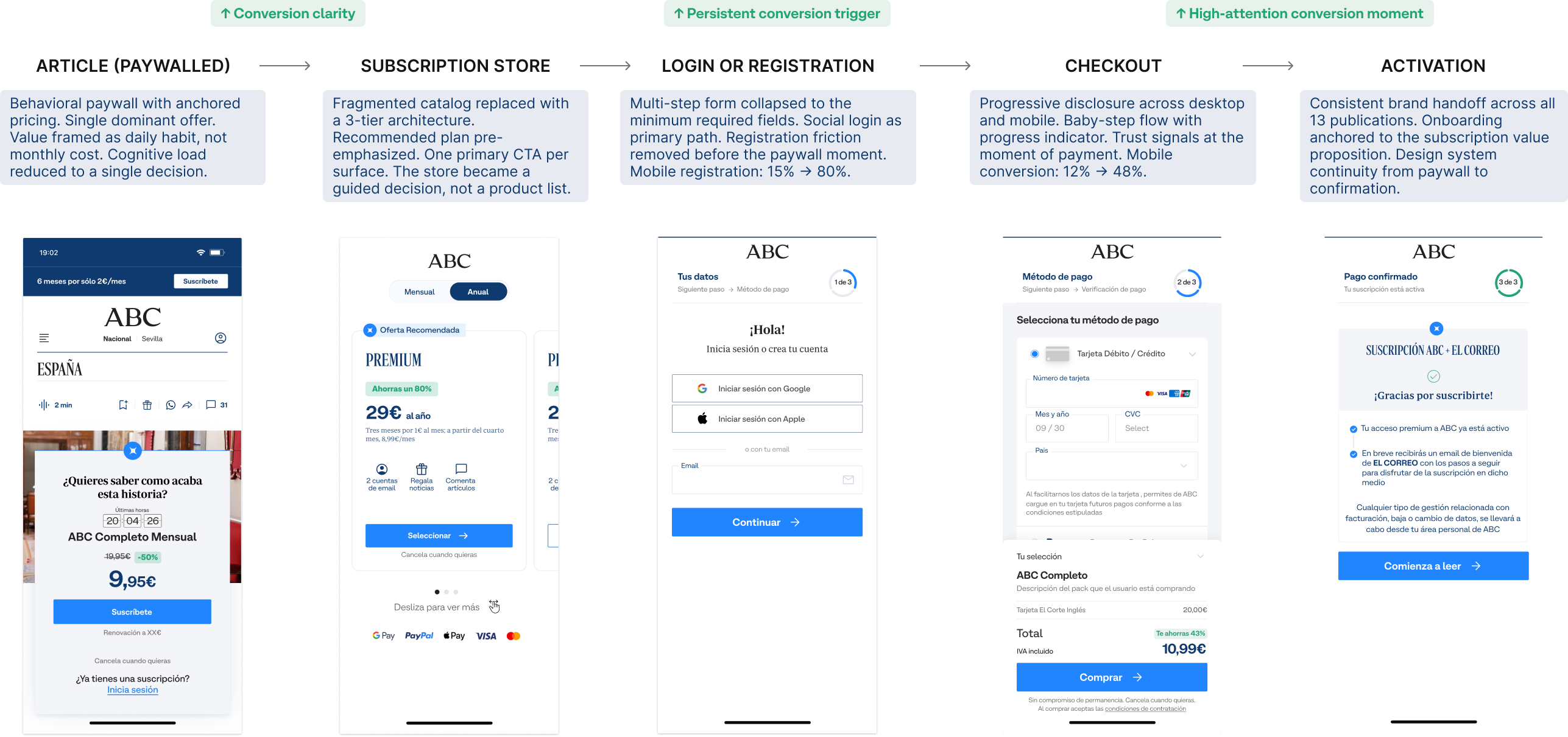
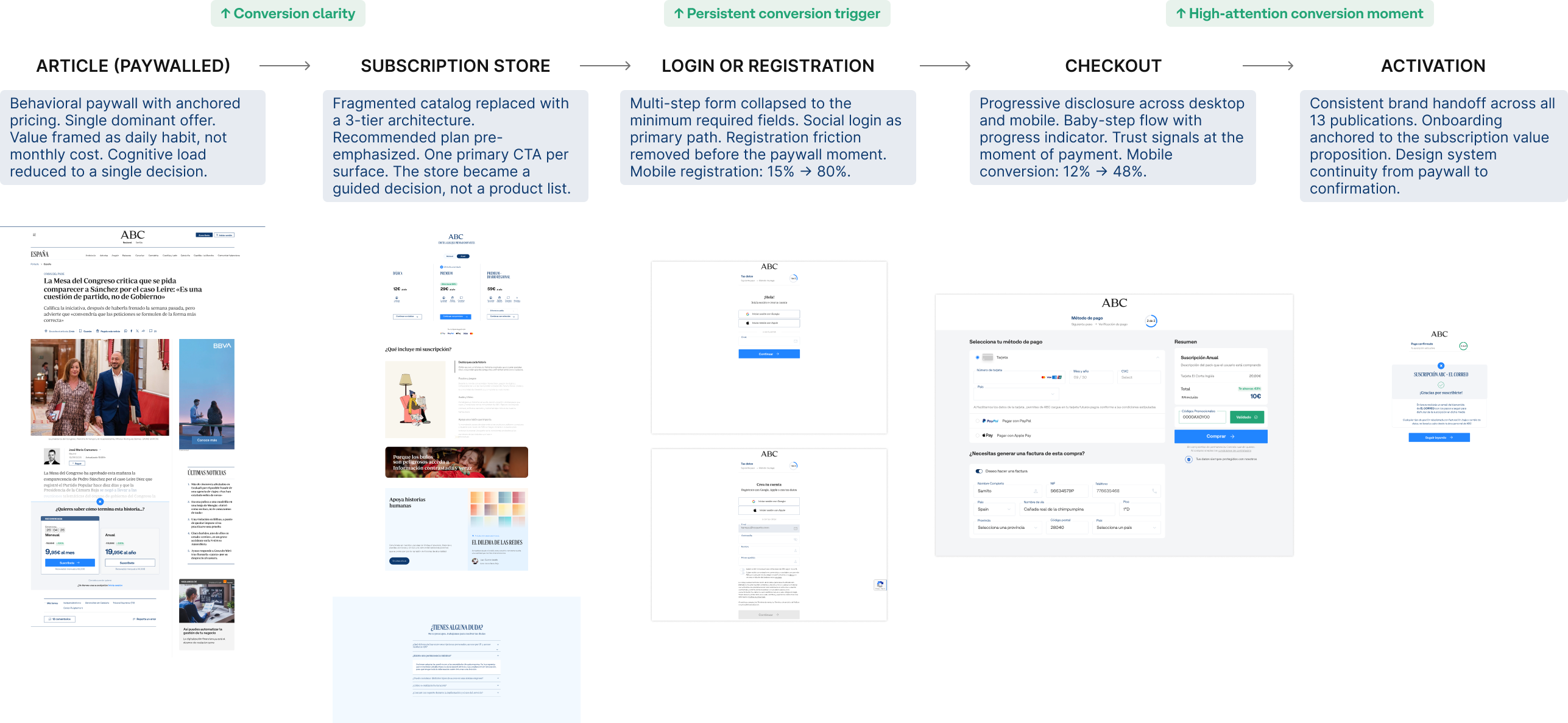
Full funnel view Article → Store → Login → Checkout → Activation
05 — EL PROBLEMA DE ESCALA
The system had to work for brand teams with their own designers, developers and editorial calendars. We couldn't mandate adoption. We had to make the shared system easier to use than building independently.
The documentation wasn't peripheral to the work. It was the work. A component without a usage contract is just a suggestion.
ADOPTION
Reusable modules, shared tokens and pre-wired tracking made the system faster to integrate than a custom build. Brand teams adopted it not because they had to, but because the alternative was slower.
CONTRACTS
Every component shipped with a usage contract: inputs, constraints, tracking events. Documentation defined what could vary across brands and what couldn't. Consistency was structural, enforced by the component itself.
MEASUREMENT
If a component existed, it measured. If it measured, it did so consistently. A unified tracking layer meant experiments were comparable across brands from day one — no per-team instrumentation required.
06 — RESULTS
Mobile conversion rate
4x
From 12% to 48%. Mobile was where most users arrived and where most left — so mobile is where the system had to win first.
Mobile registration
80%
Up from 15%. Removing friction before the paywall was the first unlock.
CTA click-through
+35%
New store layout with anchored pricing and clear tier hierarchy.
Subscription growth
+15%
Year-over-year, sustained across all 13 brands — not a one-time spike.
The system didn't just improve metrics — it changed how teams spend their time.
Tiempo de construcción de campaña
Construcción vs estrategia
A/B tests per month
Del brief a campaña en vivo
3 Weeks
5 Days
The clearest signal the system worked. Not a prototype metric — a production reality across 13 brands.
07 — REFLECTION
Designing for a multi-brand ecosystem is fundamentally different from designing a product. The user is not just the subscriber — it's also every team that has to implement your decisions without you in the room.
The highest-leverage work wasn't the interaction design. It was the constraint definition: deciding what could vary across brands and what couldn't. That single decision shaped everything that came after.
Systems don't fail because of design quality. They fail because the teams implementing them don't understand the decisions behind them.
What I'd do differently
Invest earlier in building local adoption champions within each brand team. The system was technically solid, but adoption velocity depends on people who understand both the system logic and their brand's specific constraints. That knowledge transfer was the bottleneck — not the component quality.