VIABILITY
Business
Subscription growth stagnated despite strong traffic. Mobile conversion was critically low. Launching a new offer required weeks of dev coordination, slowing every experiment the growth team wanted to run.
CASE STUDY → BEHAVIORAL CONVERSION SYSTEM
13 brands. No shared architecture. Every change required coordinating teams nobody had authority over.
A behavioral conversion system at the intersection of UX architecture, product design and engineering.

01 — THE CHALLENGE
Vocento operates 13 news brands across three editorial groups. Each brand had built its own subscription experience by adapting components from other brands in the same group — then adapting those adaptations.
The result was an ecosystem of fragmented code, inconsistent UX patterns, and conversion funnels that nobody fully understood or could safely modify. Every change required coordinating multiple development teams. Every experiment risked breaking adjacent brands.
The subscription model was generating revenue despite itself — not because of any coherent system.
Every team knew the funnel was broken. Nobody had the authority — or the architecture — to fix it without risking what was already working.
Three editorial ecosystems. Thirteen brands. Zero shared architecture.
02 — THE DIAGNOSIS
Before redesigning anything, we instrumented the funnel. 10,000+ users tested. Continuous A/B experimentation across brands. What we found wasn't a design problem — it was a coordination problem manifesting as a UX problem.
VIABILITY
Subscription growth stagnated despite strong traffic. Mobile conversion was critically low. Launching a new offer required weeks of dev coordination, slowing every experiment the growth team wanted to run.
DESIRABILITY
Decision paralysis from poorly structured plans. Long, confusing login, registration and checkout flows. Multiple landing pages eroded trust at payment. Subscription value was framed as a transaction, not a premium content experience.
FEASIBILITY
No shared conversion framework. Each team implemented the funnel differently. Components were reused informally without contracts. Experiments couldn't be scaled across brands because no two brands measured the same thing.
02 — THE DIAGNOSIS
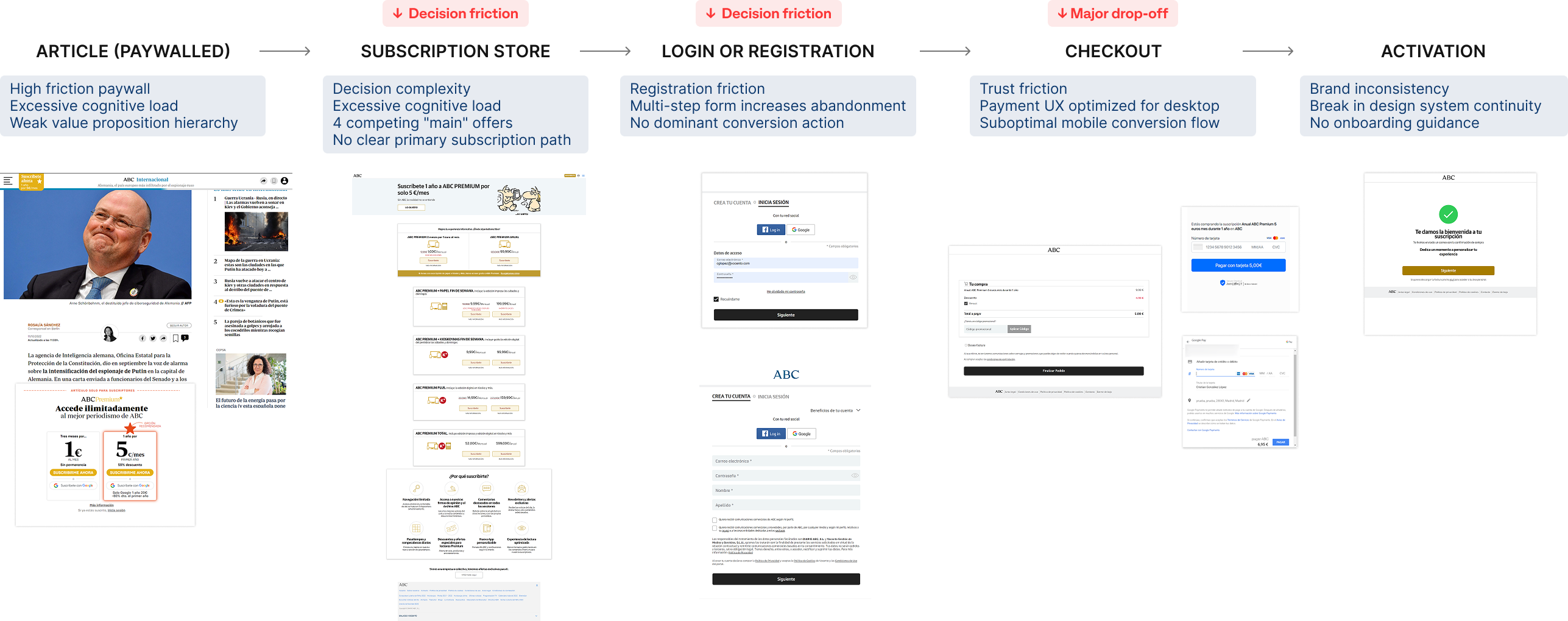
Three friction points accounted for nearly all the drop-off: the paywall (too many options), registration (too many fields), and checkout (too many steps). The same pattern across all 13 brands.
Subscription decision journey Low scannability, weak hierarchy and complex decision paths introduced friction across every stage of the funnel.
Winning behavioral insight
Older audiences weren't converting on mobile because monthly pricing felt like a lump-sum commitment. Anchoring the subscription to a familiar daily habit was the highest-performing intervention in the entire test program — across all 13 brands.
03 — THE DECISION
The obvious move was to redesign each brand's subscription experience independently. We had the briefs, the brand guidelines, the stakeholder buy-in. We chose not to. Fragmentation wasn't a visual problem — it was architectural.
Thirteen separate redesigns would have produced thirteen new inconsistencies within 18 months, as each team adapted the new components the same way they'd adapted the old ones. The constraint we set: any solution had to be deployable across all brands without a single brand team needing to understand the full system. Consistency had to be structural, not enforced.
RULED OUT
Would have reproduced the same fragmentation under a new visual layer. Short-term wins, long-term drift. The cost of coordination across teams made this a guaranteed regression within two product cycles.
RULED OUT
No authority to enforce it. Brand teams had their own roadmaps and their own editorial calendars. Any solution depending on compliance would die on first contact with a regional launch week.
COMMITTED TO
One system, adopted because it was easier to use than building independently. Structural consistency through shared modules, data contracts and a single conversion logic — not through enforcement or policy.
04 — THE SYSTEM · PRINCIPLES
One shared architecture that 13 teams could implement without breaking each other. Four principles governed every component in the system.
Problem
Too many subscription combinations created decision paralysis.
Implementation
Reduced multiple bundles to 3 core tiers
Clear primary subscription path
Single dominant CTA per surface
Impact
Users understand the offer and decide faster.
Problem
Attention had no anchor. Everything competed visually.
Implementation
Recommended plan highlighted
Structured pricing hierarchy
Visually dominant primary actions
Impact
Users identify the best option without scanning the full page.
Problem
Options were structured without supporting the decision.
Implementation
Recommended plan pre-emphasized
Monthly entry point + annual upgrade
Clear side-by-side comparison
Impact
Choice overload reduced. Decision path clarified.
Problem
The value proposition wasn't visible at a glance.
Implementation
Reduced text density
Clear offer grouping
Bullet-based benefit lists
Impact
Users evaluate the subscription in seconds, not minutes.
04 — THE SYSTEM · ARCHITECTURE
The subscription catalog was collapsed into a three-tier model shared across the ecosystem. Cognitive load dropped. Experimentation scaled. A single architecture governed all 13 brands.
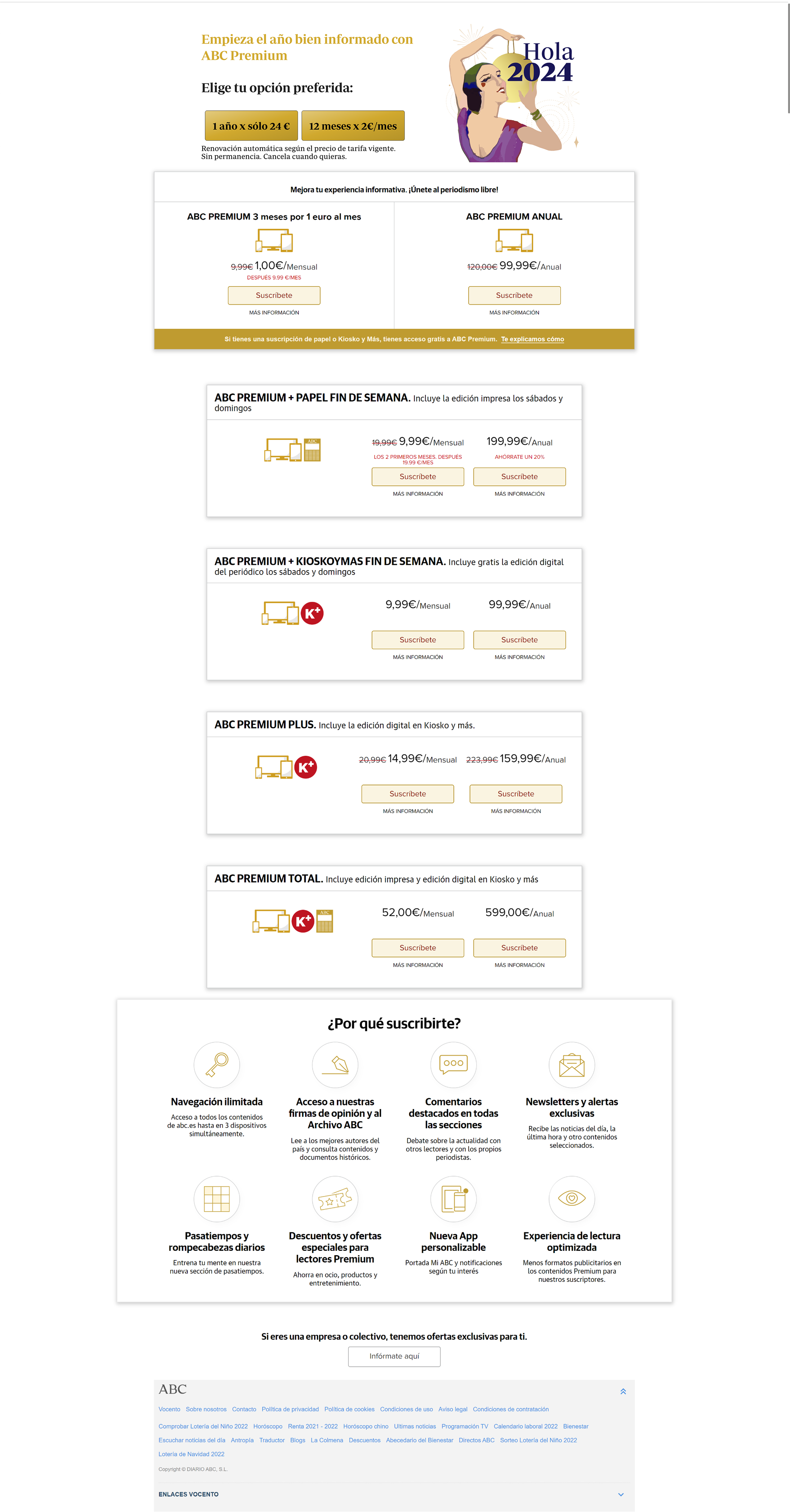
The previous store presented numerous product variations without a clear structure. No visual hierarchy. No scannability. No offer prioritization. Cognitive load made the purchase decision unnecessarily complex.
The redesigned architecture transformed the store from a product catalog into a guided decision experience. A simplified three-tier model reduced cognitive load while strengthening value perception at the moment of decision.
The new subscription model unified national and regional journalism into a single, coherent structure.
Access to essential digital journalism content.
Extended digital access including investigative reporting, archives and subscriber-only benefits.
Premium digital access combined with a regional newspaper subscription.
A single tier that unified national and regional journalism, reducing product fragmentation and enabling a consistent subscription system across the group.
Learning
A unified tier model turned scattered subscription implementations into a single platform. Users got clearer decisions. The business got scalable subscription management across the ecosystem.
04 — THE SYSTEM · ECOSYSTEM
The regional bundle integrated Vocento's local newspapers into the same subscription architecture. Subscribers could combine ABC with regional titles — El Correo, Diario Vasco, Diario Montañés, El Comercio, La Rioja, Las Provincias, El Norte de Castilla, Hoy, Sur, Ideal and La Verdad.
The platform was deployed across all publications. One shared core. Local customization at the surface. Every brand team got the same foundation, with the ability to adapt tone and messaging without touching the underlying architecture.
The regional bundle let subscribers combine ABC with selected local newspapers, creating a unified national-regional subscription. Flagship national content plus trusted regional journalism — higher perceived value, preserved editorial identity.
The subscription architecture scaled across Vocento's full multi-brand ecosystem, integrating national and regional publications on the same platform while each brand kept its editorial identity and audience focus.
04 — THE SYSTEM · COMPONENTS
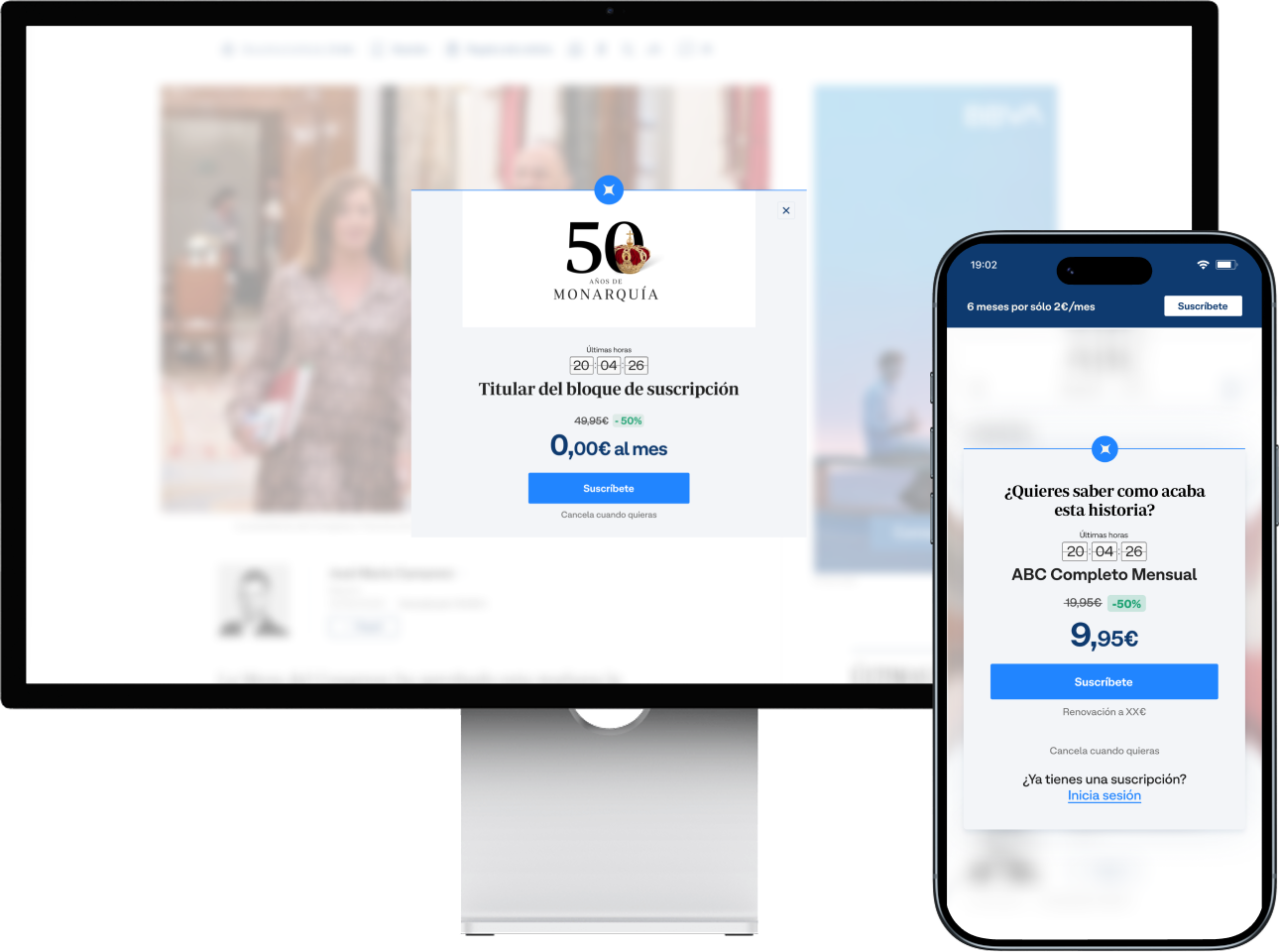
The subscription experience was built as a behavioral conversion system composed of coordinated entry points across the reading journey. Each component addresses a different conversion moment: persistent trigger, decision moment, or high-attention interruption.
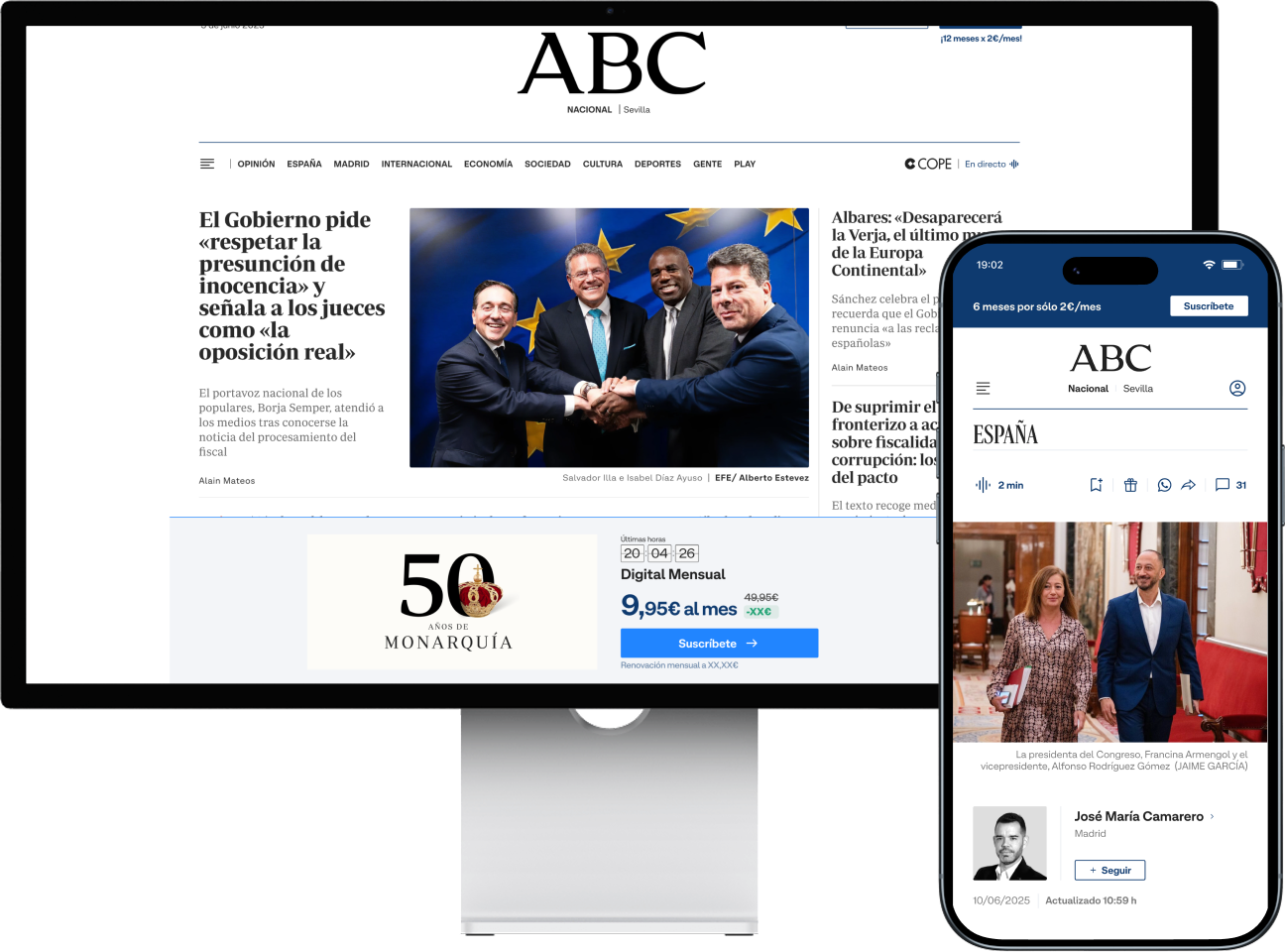
A low-friction conversion trigger that runs alongside the reading experience. Continuous subscription visibility without interrupting article consumption.
Redesigned to simplify decision-making and create a clear offer hierarchy. Instead of fragmented subscription combinations, a simplified set of plans structured for fast comparison.
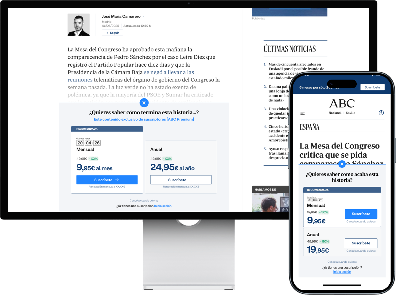
Designed as a focused conversion moment inside the reading flow. Unlike the persistent banner, the pop-up concentrates attention on a single offer and strips out any cognitive overhead.
04 — THE SYSTEM · STORE
The store was the highest-intent surface and the highest drop-off point. Its fragmented structure was the single biggest blocker to subscription conversion across the ecosystem.
The redesign was grounded in behavioral research: choice architecture, information hierarchy and perceived value. Every element was tied to a decision-theory reference — because every element had to be defensible across 13 brand teams.
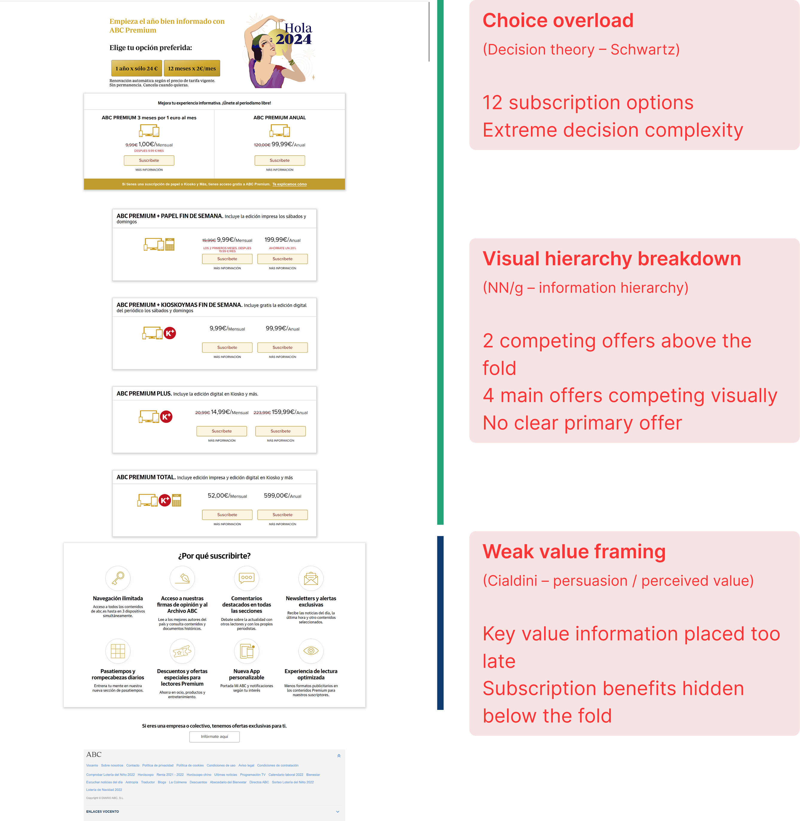
Too many options without a clear hierarchy. Multiple offers competed for attention. Cognitive load made the purchase decision unnecessarily complex.
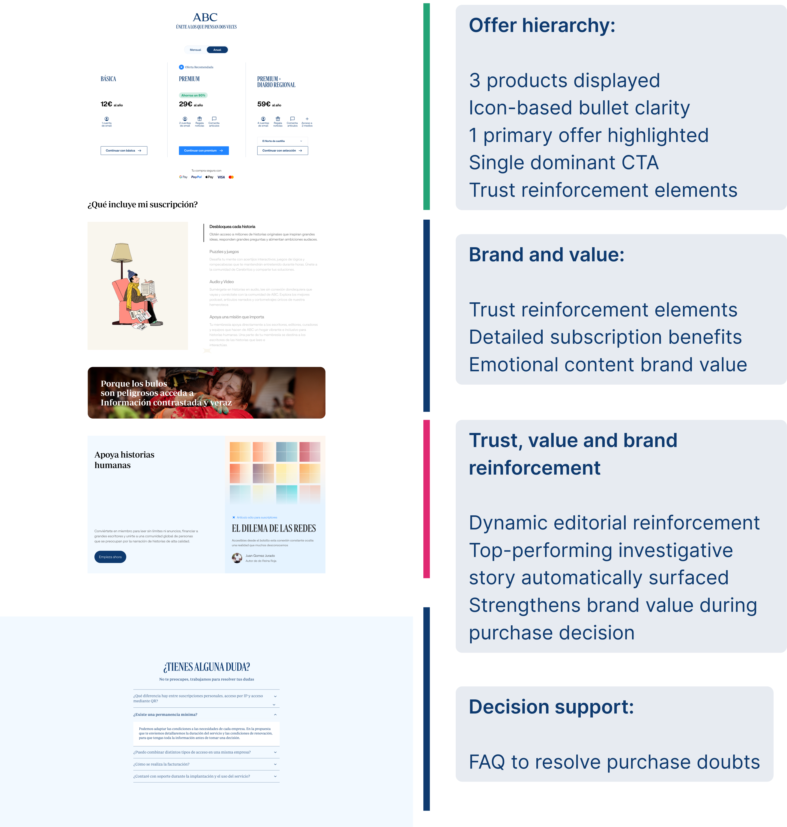
Clear hierarchy. Scannable structure. Strong visual emphasis. High-performing editorial content surfaced at the moment of decision to reinforce perceived value.
Learning
The store stopped being a product catalog and started being a guided decision. Scannability, hierarchy and editorial reinforcement turned the page into the highest-performing conversion surface in the system.
04 — THE SYSTEM · CHECKOUT
Checkout was the point of highest conversion intent and the point of highest drop-off. Progressive disclosure across desktop and mobile reduced cognitive load at the exact moment users decided whether to trust the transaction.


Total volume (ABC + Media)
149,493
+31,113 net subscribers from checkout friction reduction
ABC volume
54,461
+39.2% growth driven by simplified payment flows
ARPU (Media)
€110.64
Premium value maintained despite high-volume acquisition
Monthly churn (Media)
4.35%
Net reduction in post-sale friction
Monthly churn (ABC)
3.10%
−23.8% abandonment rate after checkout redesign
Billing churn (Group)
3.63%
Stabilized across the group under unified system
04 — THE SYSTEM · UNIFIED FUNNEL
A single conversion funnel — article → store → login → checkout → activation — shared across all 13 brands. Every brand team got the same foundation, with the ability to adapt tone and messaging without touching the underlying architecture.
Seven buyer personas per brand modulated emotional messaging while the framework stayed consistent. Consistency was structural, not enforced.
Unified conversion system Five-stage journey with shared UI patterns, from article paywall through activation.
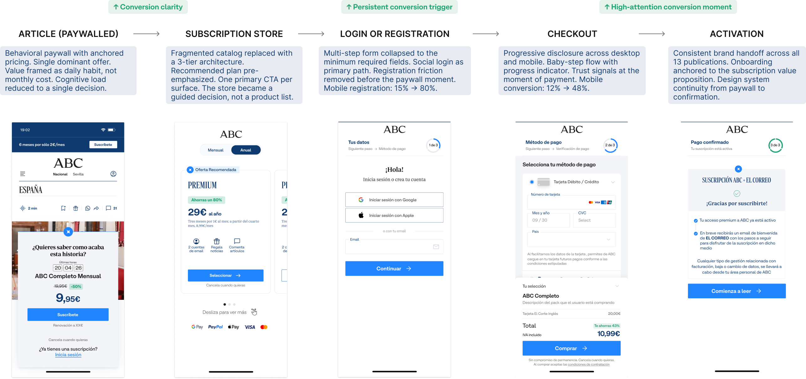
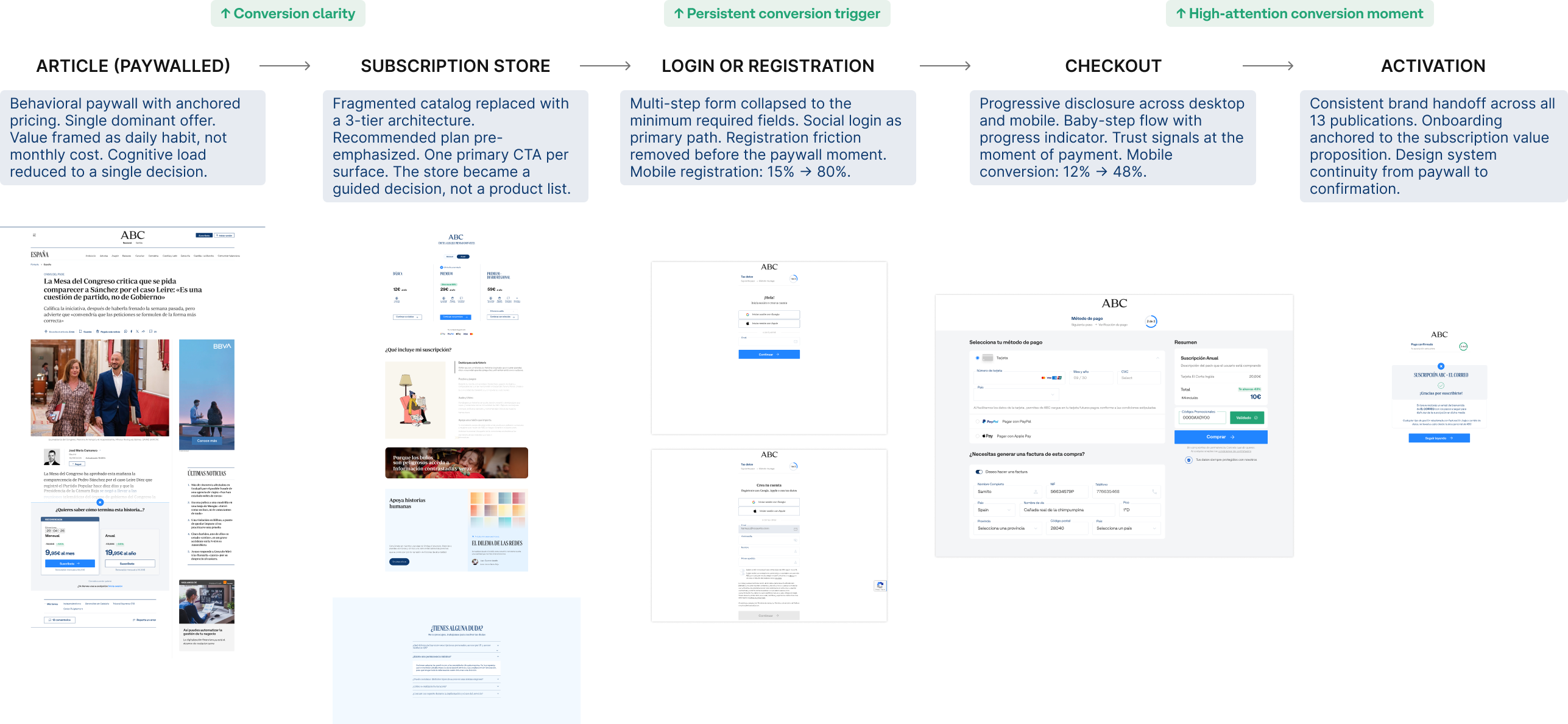
Full funnel view Article → Store → Login → Checkout → Activation
05 — THE SCALE PROBLEM
The system had to work for brand teams with their own designers, developers and editorial calendars. We couldn't mandate adoption. We had to make the shared system easier to use than building independently.
The documentation wasn't peripheral to the work. It was the work. A component without a usage contract is just a suggestion.
ADOPTION
Reusable modules, shared tokens and pre-wired tracking made the system faster to integrate than a custom build. Brand teams adopted it not because they had to, but because the alternative was slower.
CONTRACTS
Every component shipped with a usage contract: inputs, constraints, tracking events. Documentation defined what could vary across brands and what couldn't. Consistency was structural, enforced by the component itself.
MEASUREMENT
If a component existed, it measured. If it measured, it did so consistently. A unified tracking layer meant experiments were comparable across brands from day one — no per-team instrumentation required.
06 — RESULTS
Mobile conversion rate
4x
From 12% to 48%. Mobile was where most users arrived and where most left — so mobile is where the system had to win first.
Mobile registration
80%
Up from 15%. Removing friction before the paywall was the first unlock.
CTA click-through
+35%
New store layout with anchored pricing and clear tier hierarchy.
Subscription growth
+15%
Year-over-year, sustained across all 13 brands — not a one-time spike.
The system didn't just improve metrics — it changed how teams spend their time.
Campaign build time
Build vs strategy
A/B tests per month
Brief to live campaign
3 Weeks
5 Days
The clearest signal the system worked. Not a prototype metric — a production reality across 13 brands.
07 — REFLECTION
Designing for a multi-brand ecosystem is fundamentally different from designing a product. The user is not just the subscriber — it's also every team that has to implement your decisions without you in the room.
The highest-leverage work wasn't the interaction design. It was the constraint definition: deciding what could vary across brands and what couldn't. That single decision shaped everything that came after.
Systems don't fail because of design quality. They fail because the teams implementing them don't understand the decisions behind them.
What I'd do differently
Invest earlier in building local adoption champions within each brand team. The system was technically solid, but adoption velocity depends on people who understand both the system logic and their brand's specific constraints. That knowledge transfer was the bottleneck — not the component quality.